Ground up identity system work for a local non-profit that aims to assist women on their path to empowerment. Read more about these rad humans at sisterroots.com
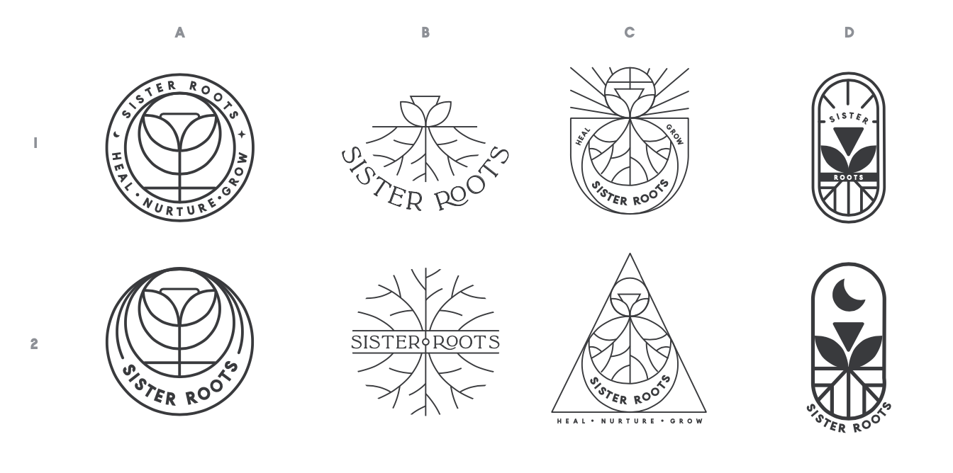
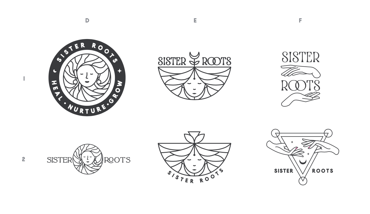
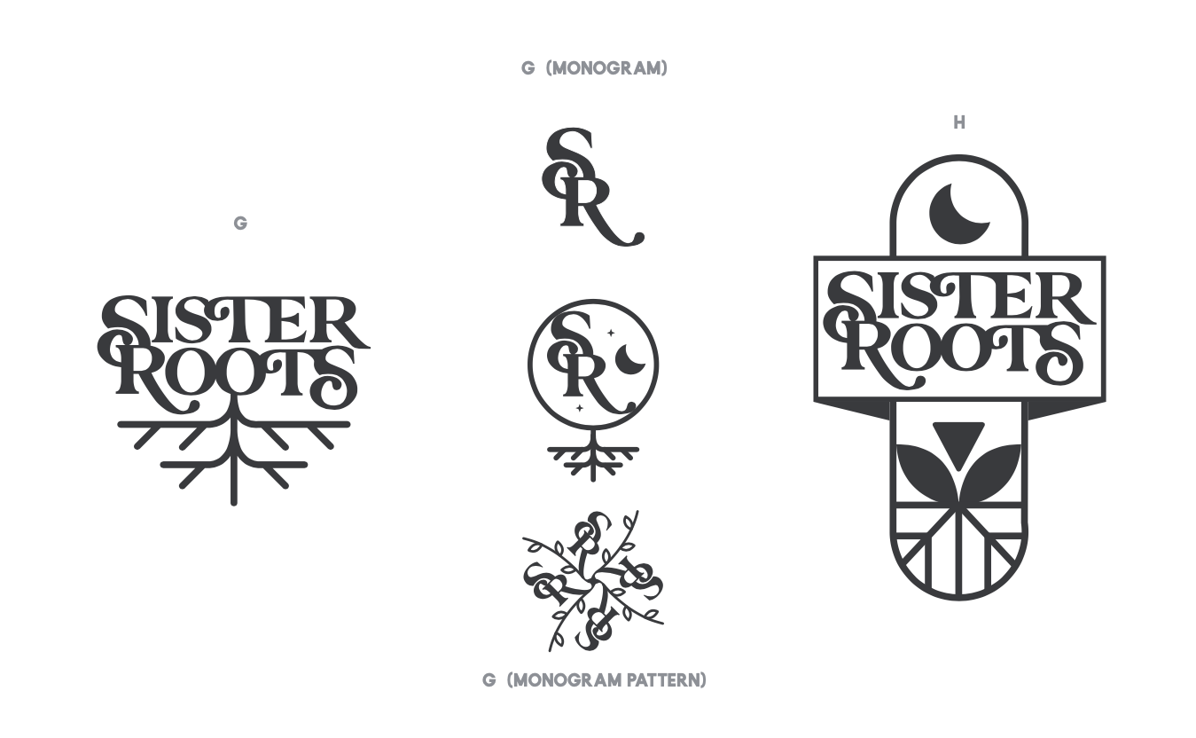
I began the project with a "go broad" approach that netted out three distinct styles. 1. Iconic Minimalism, 2. Human Nature, and 3. Type Rooted.
Iconic Minimalism
Human Nature
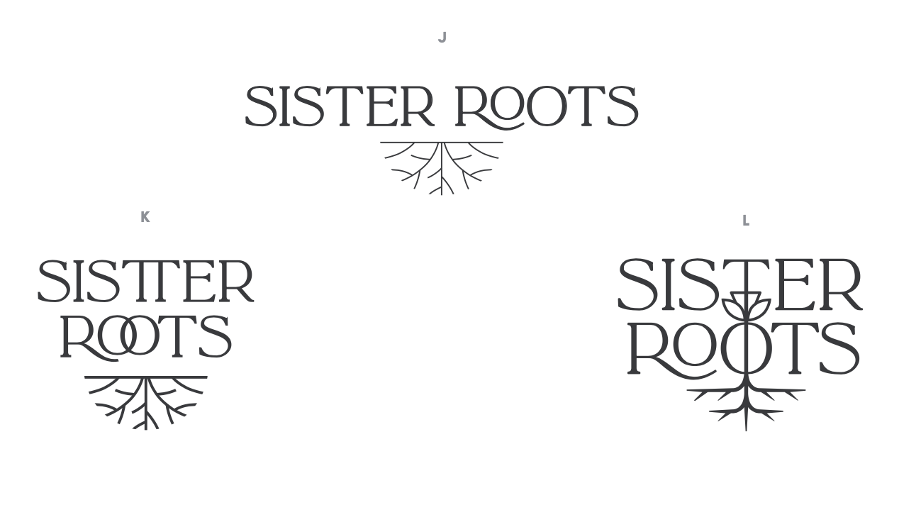
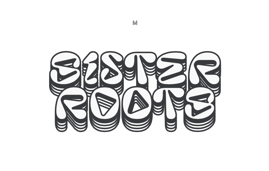
Type Rooted
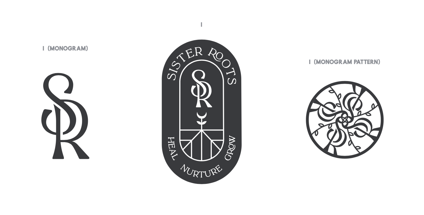
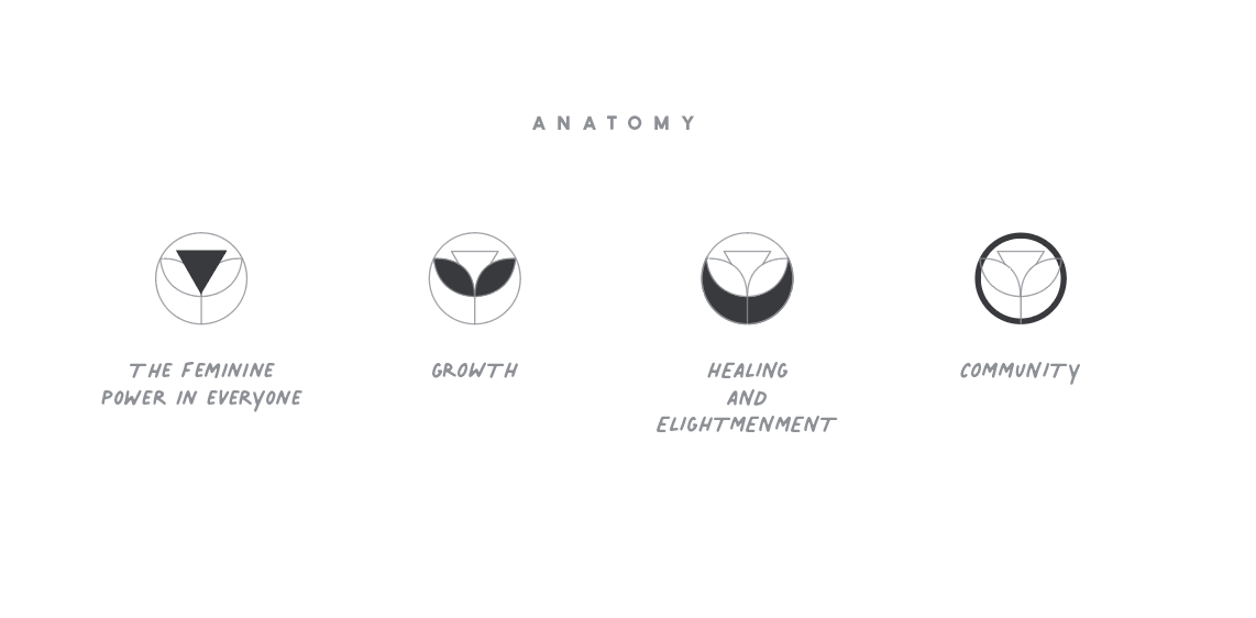
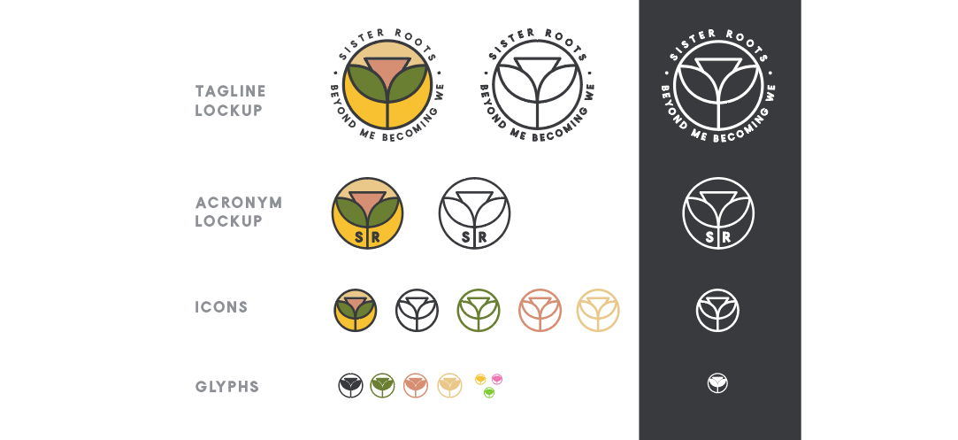
Narrowing down, the Sister Roots team gravitated towards the Iconic Minimalism direction, with a nudge to further simplify the mark, removing the literal woman symbol ( ♀ ) with more focus on the following 4 elements to represent the brand's work.
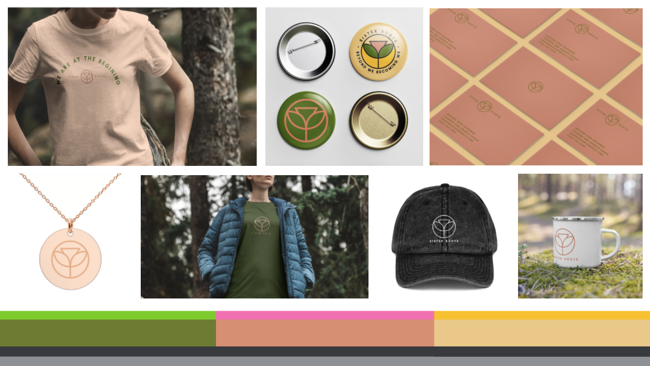
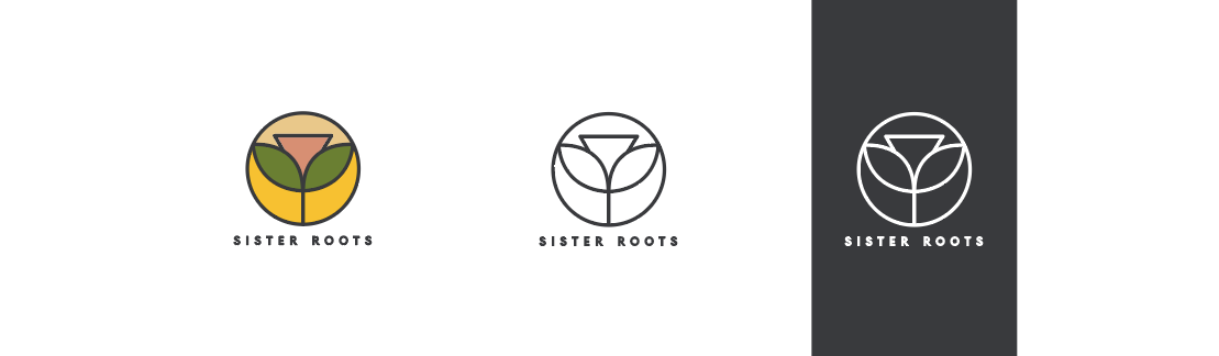
Leading us to the final logo looking like this, along with a collection of lockups and icons/glyphs.
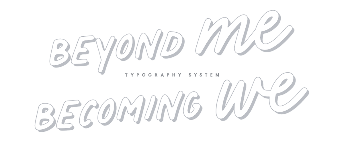
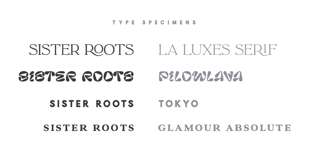
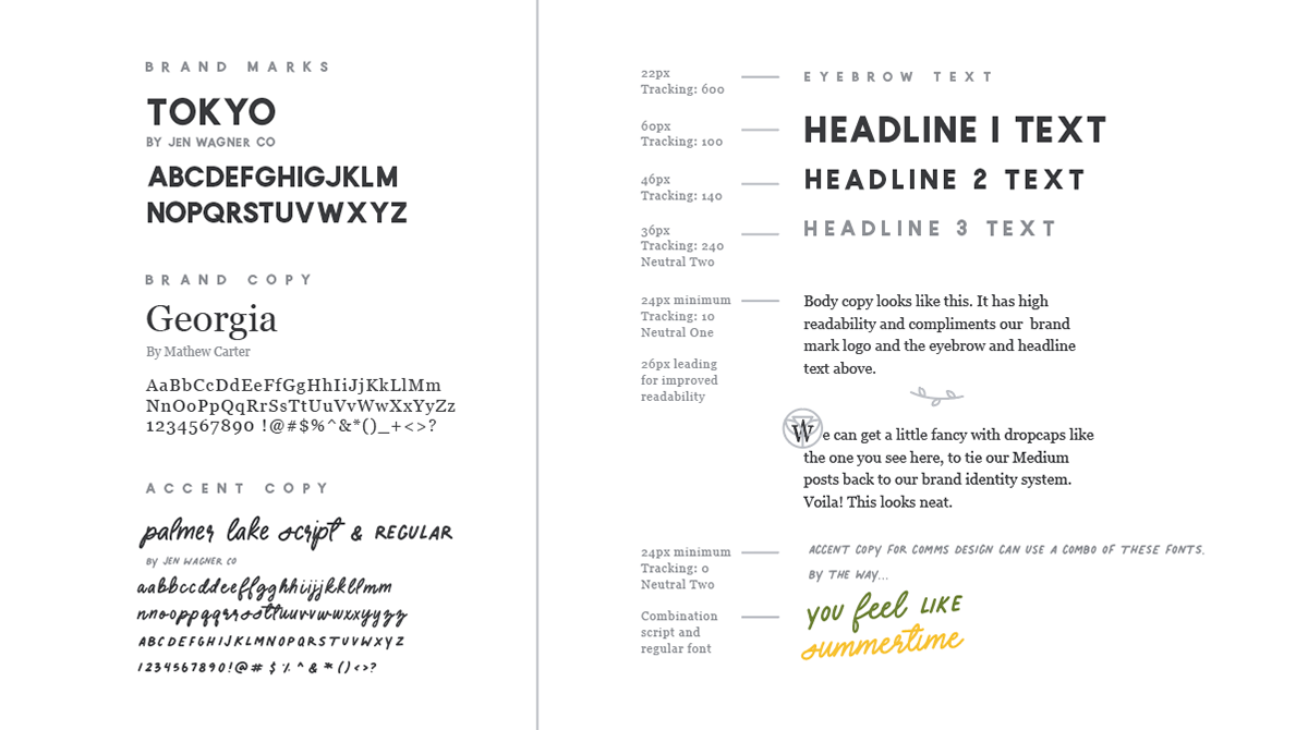
Looking at the typography system for the brand, Sister Roots gave the guidance to balance polish with approachability. With the Tokyo font from Jen Wagner Co. used in the primary mark -- I wanted to tie that to Sister Roots' content design by using this bold sans serif font for headlines.
To get the aforementioned balance that I describe as "sophistication with a wink", I leaned on the classic serif font Georgia (by Mathew Carter) and another gem from Jen Wagner Co called Palmer Lake.
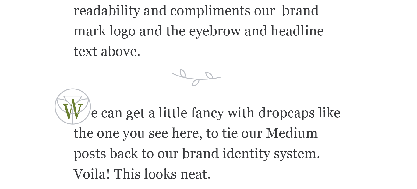
A closer look at the body copy styling
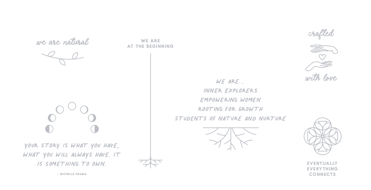
A micro-illustration system