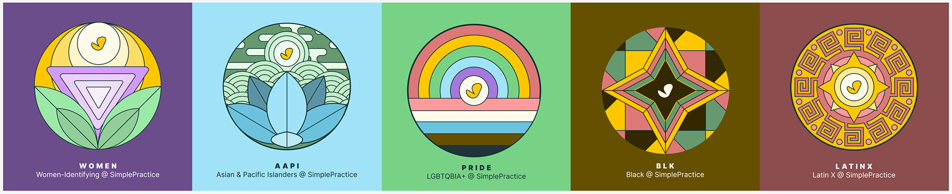
SimplePractice ERG logos
Illustration, Storytelling
Imagine a vibrant tapestry woven from threads of unique experiences, talents, and perspectives. That's the magic of Employee Resource Groups (ERGs) at work. In these vibrant communities, diverse voices unite to create a symphony of support, growth, and innovation.
ERGs are the heartbeats of inclusion. They warmly embrace colleagues of all backgrounds, fostering a sense of belonging and connection. Professional and personal growth flourishes like wildflowers in spring within these safe spaces.
But their impact extends far beyond individual lives. ERGs are the secret ingredient in a company's recipe for success. They unlock a treasure trove of diverse perspectives, fueling creativity and leading to brighter decisions. Imagine a kaleidoscope of ideas, each adding a unique sparkle to the solution!
These communities act as stepping stones for aspiring leaders, offering mentorship and fostering cultural understanding. This compass guides businesses toward a future filled with harmony and thriving collaboration in our ever-connected world.
That's why, at SimplePractice, I was deeply humbled to lead the design of logos for our five ERGs. Each logo is a vibrant symbol, reflecting its group's unique spirit and purpose. Just like the ERGs themselves, they are a testament to the power of diversity and its positive impact on our business and beyond.
Now, let's delve into the symbolism and color choices behind each logo.
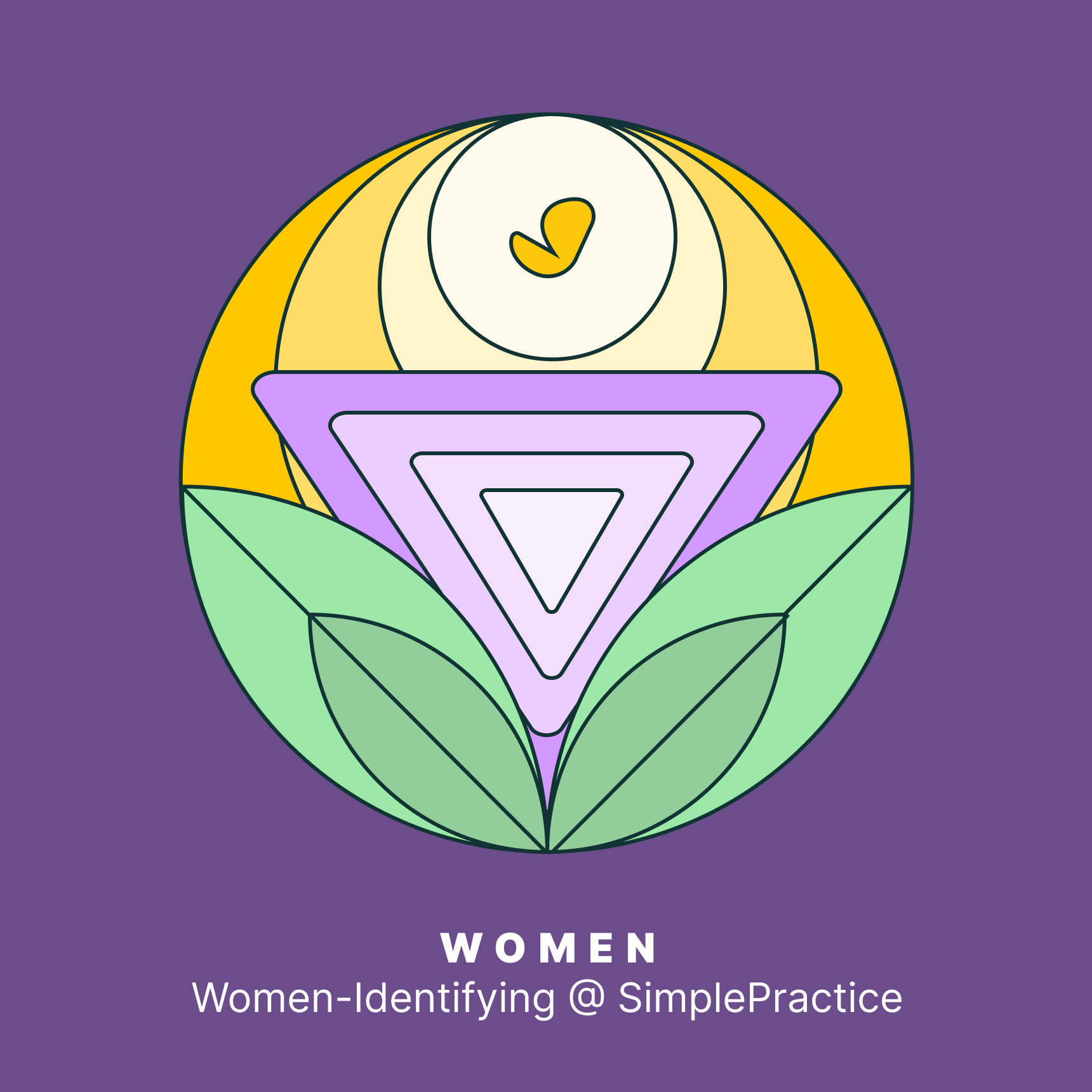
The logo utilizes a palette of purple, yellow, and green, each with its significance. Purple is often associated with dignity, wisdom, and respect, reflecting qualities highly regarded by the women at your company. It serves as a background, signifying that these attributes are foundational. Yellow, traditionally linked to optimism, enlightenment, and happiness, surrounds the central SimplePractice mark, hinting at a nurturing and positive environment that the company fosters for women. Green, the color of growth, harmony, and freshness, is depicted through leaves at the base, symbolizing the growth and natural development of women's roles within SimplePractice.
At the heart of the logo, a badge-like figure combines several elements. The outermost shape, reminiscent of an upside-down triangle, is a classic symbol of femininity. This shape embraces all the other elements, representing inclusion and the supportive structure within the company.
Inside the triangle is a circle intersecting with SimplePractice's butterfly mark that also looks like a check mark, representing achievement and goals attained. The checkmark, a universal symbol of correctness, approval, and completion, suggests that the women at SimplePractice are accomplishing their goals and contributing positively to the company. The circle behind it may symbolize unity, wholeness, and the cyclical nature of continuous improvement.
Inside the triangle is a circle intersecting with SimplePractice's butterfly mark that also looks like a check mark, representing achievement and goals attained. The checkmark, a universal symbol of correctness, approval, and completion, suggests that the women at SimplePractice are accomplishing their goals and contributing positively to the company. The circle behind it may symbolize unity, wholeness, and the cyclical nature of continuous improvement.

The prominent use of blue in various shades evokes a sense of calm, stability, and trust. Blue is also reminiscent of the vast oceans that connect the diverse regions of Asia and the Pacific Islands, symbolizing the connection between the different cultures within the AAPI community. This color can represent the idea of unity and collective strength within the AAPI group at SimplePractice.
Central to the logo is a stylized lotus flower, a significant symbol across many Asian cultures, often representing purity, enlightenment, self-regeneration, and rebirth. Its depiction in the logo can signify the growth and flourishing of AAPI individuals within the company. The lotus flower is rooted in muddy water yet rises above the surface to bloom with remarkable beauty, paralleling the journey of AAPI individuals who rise above challenges to achieve success.
The logo's backdrop features circular patterns resembling waves or clouds, motifs common in Asian art. These patterns signify the flow of energy, adaptability, and dynamic nature of the AAPI community. They can also be interpreted as the interconnectedness of AAPI people with each other and the company and their ability to navigate and adapt to different environments.
Above the lotus, the symbol at the center, presumably representing the sun or a pearl, further enhances the cultural representation. The sun is a universal symbol of life and growth, while pearls are highly valued in many Pacific cultures, signifying wisdom, integrity, and generosity.
The light blue background is soothing and provides a contrasting backdrop that makes the central elements stand out. This could represent the welcoming and supportive environment SimplePractice aims to provide for the AAPI community.
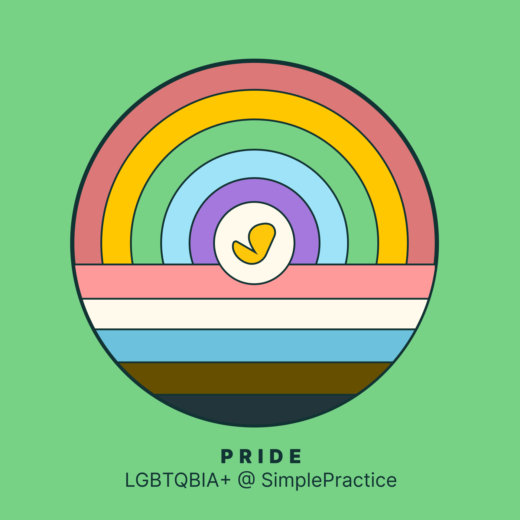
The Pride ERG logo for LGBTQIA+ at SimplePractice is vibrant and inclusive, celebrating the diversity and unity of the LGBTQIA+ community within the company.
At the heart of the logo is a rainbow, an enduring symbol of LGBTQIA+ pride and diversity. The rainbow features a spectrum of colors that represent the different identities and orientations within the community. Each color in the traditional rainbow flag has a meaning, such as red for life, orange for healing, yellow for sunlight, green for nature, blue for harmony, and violet for spirit. This colorful display celebrates the spectrum of human sexuality and gender identity and is inclusive of the entire LGBTQIA+ community.
This logo incorporates additional stripes, reflecting the updated versions of the Pride flag, which include black and brown stripes to represent people of color and light blue, pink, and white, which are the colors of the Transgender Pride Flag. Including these colors acknowledges the diversity within the LGBTQIA+ community and the importance of intersectionality, including race and gender identity.
Central to the design is our SimplePractice yellow butterfly, symbolizing acceptance and the core values of care and support that SimplePractice extends to all employees, including those who are part of the LGBTQIA+ community. This also suggests an individual’s authentic self is at the heart of their identity, valued and embraced by the company.
The logo is set against a green background, a color often associated with growth, harmony, and renewal. This choice of background may imply a supportive environment where LGBTQIA+ individuals can thrive and their contributions are nurtured.
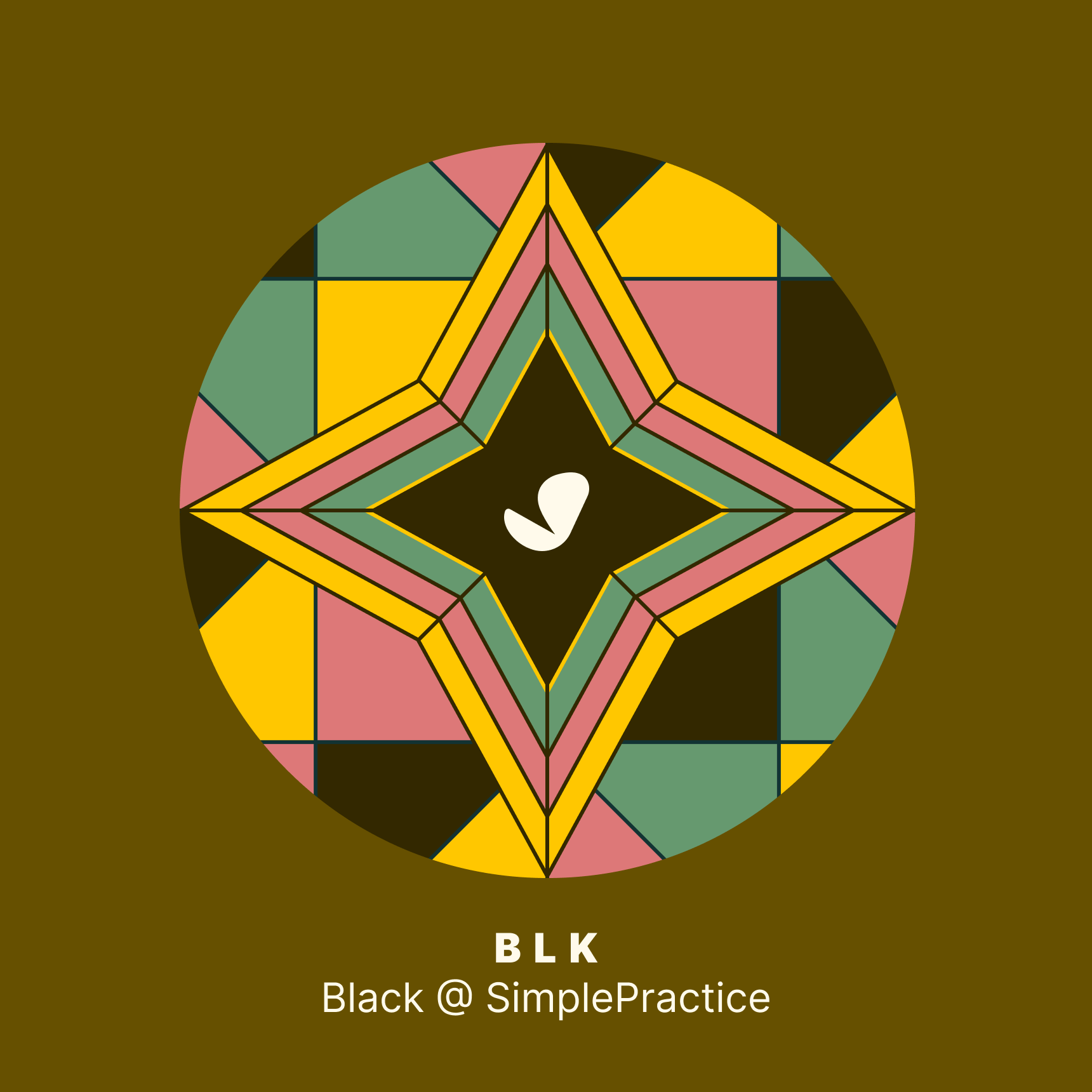
The logo designed for the Black Employee Resource Group (ERG) at SimplePractice is a thoughtful composition that captures elements of the African diaspora's cultural aesthetics, reflecting Black cultures' diversity, resilience, and richness.
The central motif in the logo is a star, often associated with guidance, excellence, and a high-reaching attitude. It's rendered in a way that resembles a compass, which could symbolize the role of Black employees in navigating the company toward greater diversity and inclusivity. The star's geometric patterns and sharp angles are also an homage to the complex and influential art found in many African cultures, representing a connection to historical roots and the intricate social fabric of the Black community.
The Color Palette: The deep brown background symbolizes the earth, resilience, stability, and the foundation that Black employees provide to the company. The incorporation of warm colors such as red and yellow is evocative of African textiles, representing vitality, energy, and creativity. Green could symbolize growth and prosperity, and including black in the star's center may represent the central role of Black culture and identity.
The placement of our SimplePractice logo in the center of the star further personalizes this logo, indicating the love, care, and central role that Black employees have within the SimplePractice community. It's a focal point that also underscores the company's commitment to fostering an environment where Black employees are valued, heard, and appreciated.
The geometric patterning around the star resembles quilt designs that have historically been part of pan-African American heritage. Quilts are often used to tell stories and pass on family legacy and history. This connection might speak to the storytelling nature of the company's work and the stories of progress, innovation, and unity that Black employees contribute to.
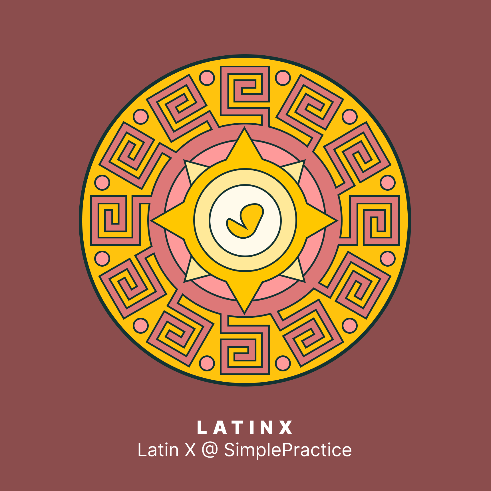
The LatinX ERG logo at SimplePractice is a vibrant and dynamic emblem that captures the spirit and cultural richness of the Latino community within the company.
The logo centers on a bright yellow sun motif, a symbol widely recognized in many Latino cultures. The sun represents vitality, energy, and the life-giving force of the sun. The sun is often associated with the Aztec sun god, a central figure in indigenous Mexican culture, signifying the historical and spiritual heritage that informs Latin American identity.
Surrounding the sun are a series of intricate red and orange patterns reminiscent of the complex designs found in pre-Columbian art, textiles, and architecture. These patterns could be inspired by Mayan or Aztec motifs, which are known for their geometric precision and symbolic significance. These motifs not only celebrate the ancient heritage but also showcase the attention to detail and creativity that Latino employees bring to SimplePractice.
The background color is rich maroon, which gives a feeling of depth and grounding. This color choice can also be associated with earth and terra cotta, materials quintessential to Latin American craftsmanship and architecture. It may evoke the importance of foundation and resilience, attributes Latino employees contribute to the company's strength.
The bold yellow circular border that encompasses the design symbolizes unity and continuity, reflecting the sense of community and connectedness that is a hallmark of Latino culture.
The circular shape around the SimplePractice mark itself can be interpreted as a representation of the globe, highlighting the global impact of Latino culture and the inclusive worldview that the community embraces.