Strategy, Visual Design, Storytelling

Creating an annual playbook for my design organization is a strategic move that can significantly enhance team alignment, performance, and innovation—as the VP of Design for SimplePractice, presenting the following to the broader organization and investors has also effectively underscored my leadership and vision.
The playbook begins by clarifying the structure and responsibility of our design organization. Zooming out to our Product and Engineering "One Product Group," we operate in a Quartet model with Pgm & Ops as the fourth, steadying leg to our stool.
This helps us develop a well-rounded and synergistic structure to ensure that product managers, Engineers, and Designers work collaboratively with handshakes instead of handoffs across our Agile environment, supported by solid ops and program management.
This helps us develop a well-rounded and synergistic structure to ensure that product managers, Engineers, and Designers work collaboratively with handshakes instead of handoffs across our Agile environment, supported by solid ops and program management.
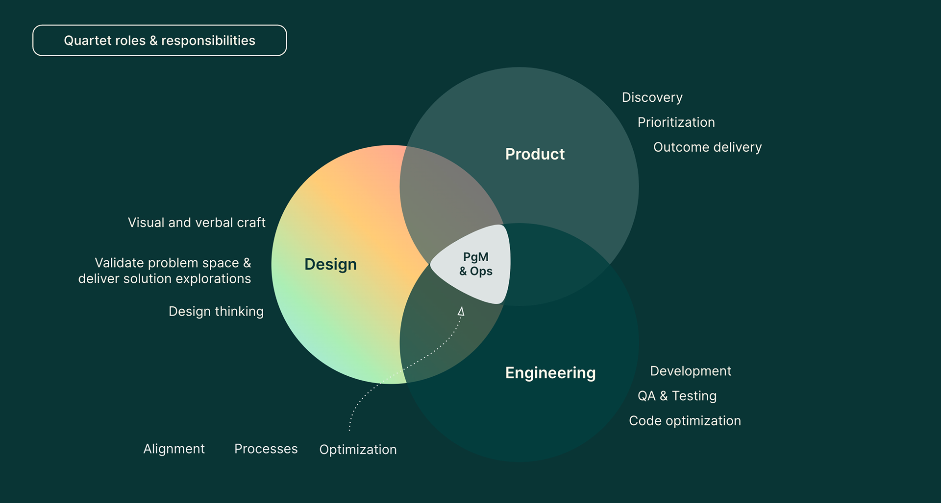
The SimplePractice Design Playbook outlines the collaborative and agile structure of the design team, emphasizing a quartet model that ensures seamless teamwork across Product, Engineering, Program Management, and Operations.
Looking closer at our design organization, the roles and responsibilities center around product design work, content design work, and leveraging design thinking to help ensure our cross-functional teams remain tethered to customer needs throughout the product life cycle. We follow the traditional IDEO philosophy of Design Thinking with these critical dimensions guiding our design process. But there are some advancements I’d like to make in 2024:
Like Atlassian, We aim to incorporate design thinking workshops with key customers to co-create new features, increase customer satisfaction, and reduce churn. We are about to set up a Customer Advisory Board and will work with the team leading that effort.
Similar to Salesforce, I see an opportunity to integrate A/B testing and data analysis into our Design Thinking process at the top of our funnel to optimize user onboarding and drive higher conversion rates.
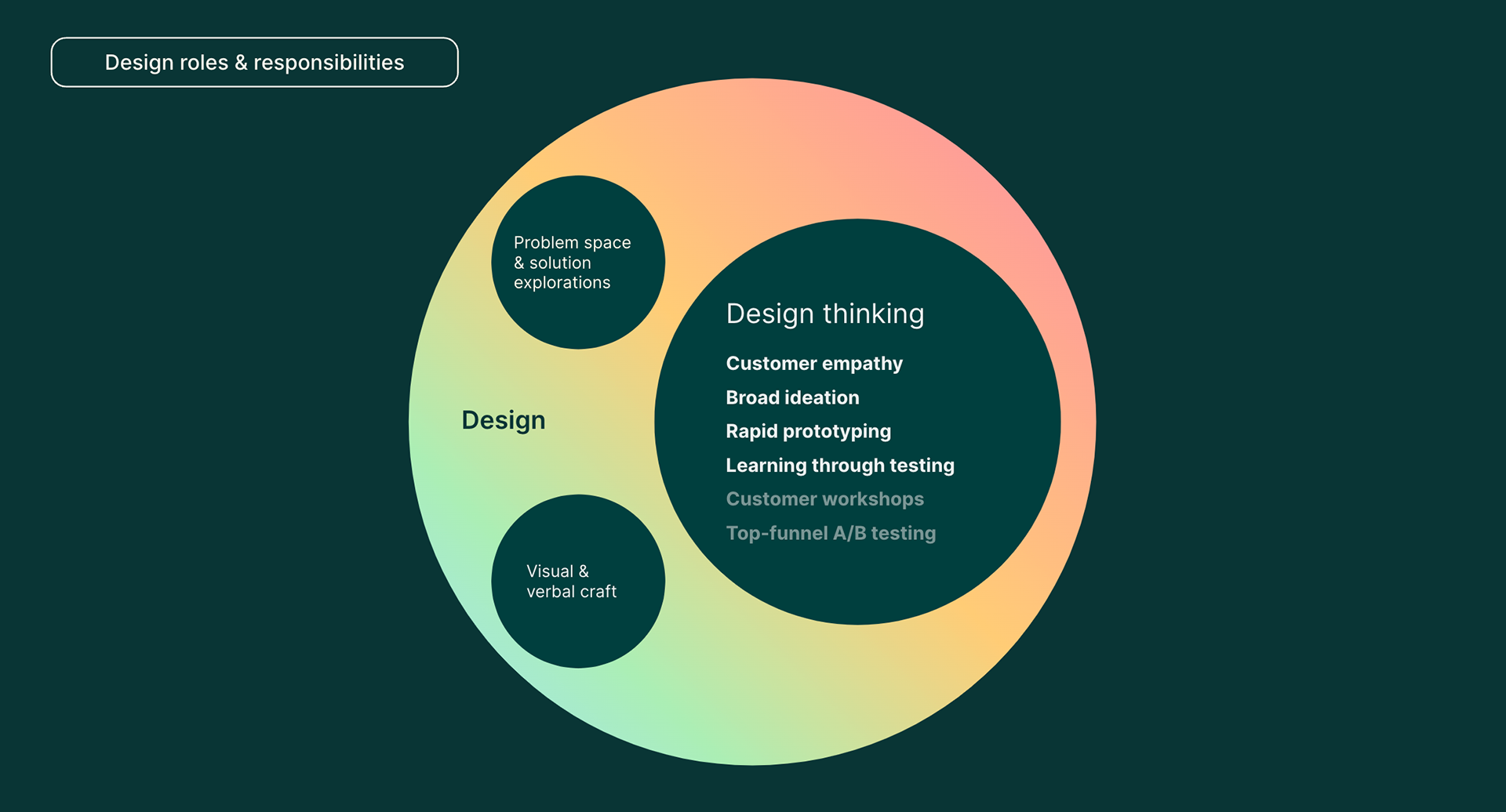
Plans to enhance design thinking in 2024 include workshops with key customers for co-creation and integrating A/B testing with data analysis to refine user onboarding and conversion rates.
Our design principles center around Empowering Simplicity through Trust and Innovation.
Simplicity results from thoughtful problem-solving of complexity, not the opposite of complexity. In other words, we often have to grapple with the most complex stuff to make things simple for users.
Trust is building solid relationships with cross-functional partners and customers through transparency and collaboration.
Innovation comes from our team thinking beyond limitations and designing for future opportunities.
Strong collaboration and pushing the bar higher comes from sharing early and often, but believing your pov, experience, and rationale for design decisions is respected and valued.
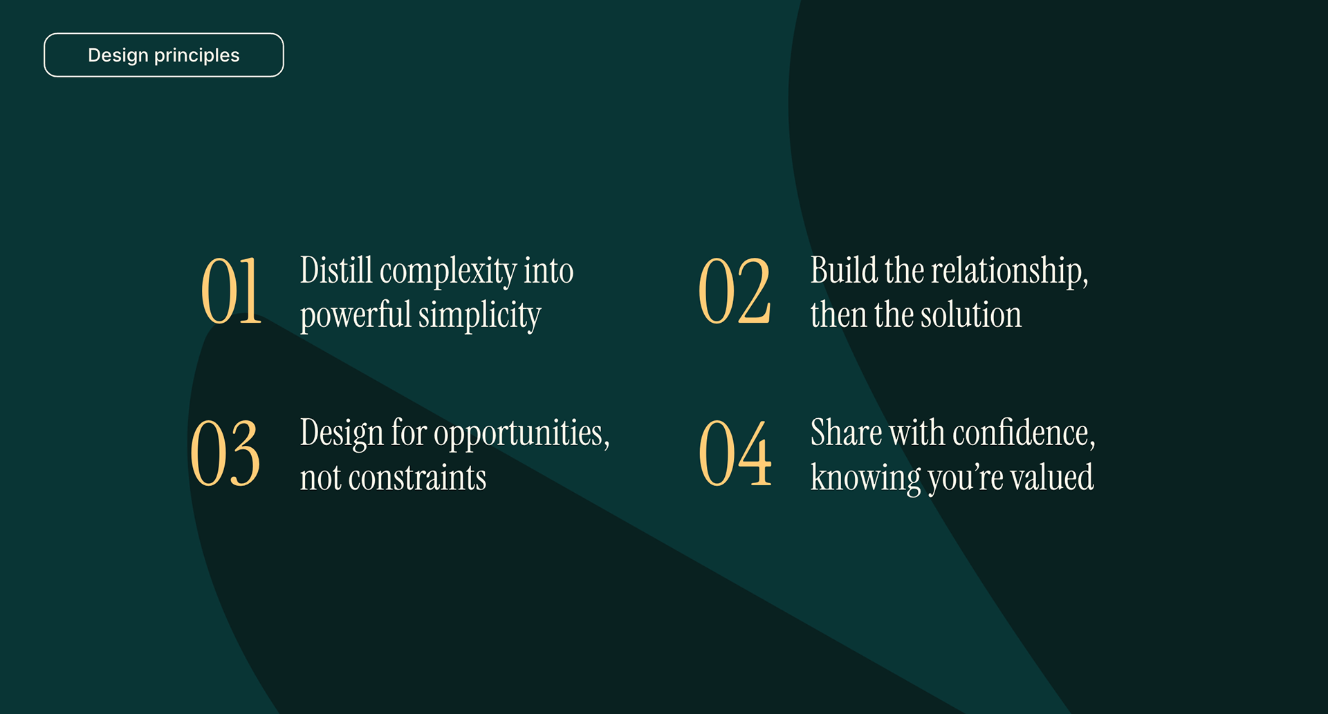
The guiding principles for design are Empowering Simplicity through Trust and Innovation, focusing on creating user-friendly solutions, building transparent relationships, and designing for future opportunities.
From pixel-perfect designs to happy customers, we’ll know our design team is winning by focusing on the right metrics.
Tracking "attention to detail" and "innovative ideas" for top-tier UX quality.
Celebrating “high customer satisfaction" and "improved task completion" as proof our designs are customer-centric.
Monitoring “reduced cycle time" and "increased design system adoption" will prove we’re practical and supporting business growth.
Investing in “career development" and "shared knowledge" will foster employee satisfaction and growth.
Finally, remember that “continuous feedback" fuels iteration and will keep our team ahead in the ever-evolving design landscape.
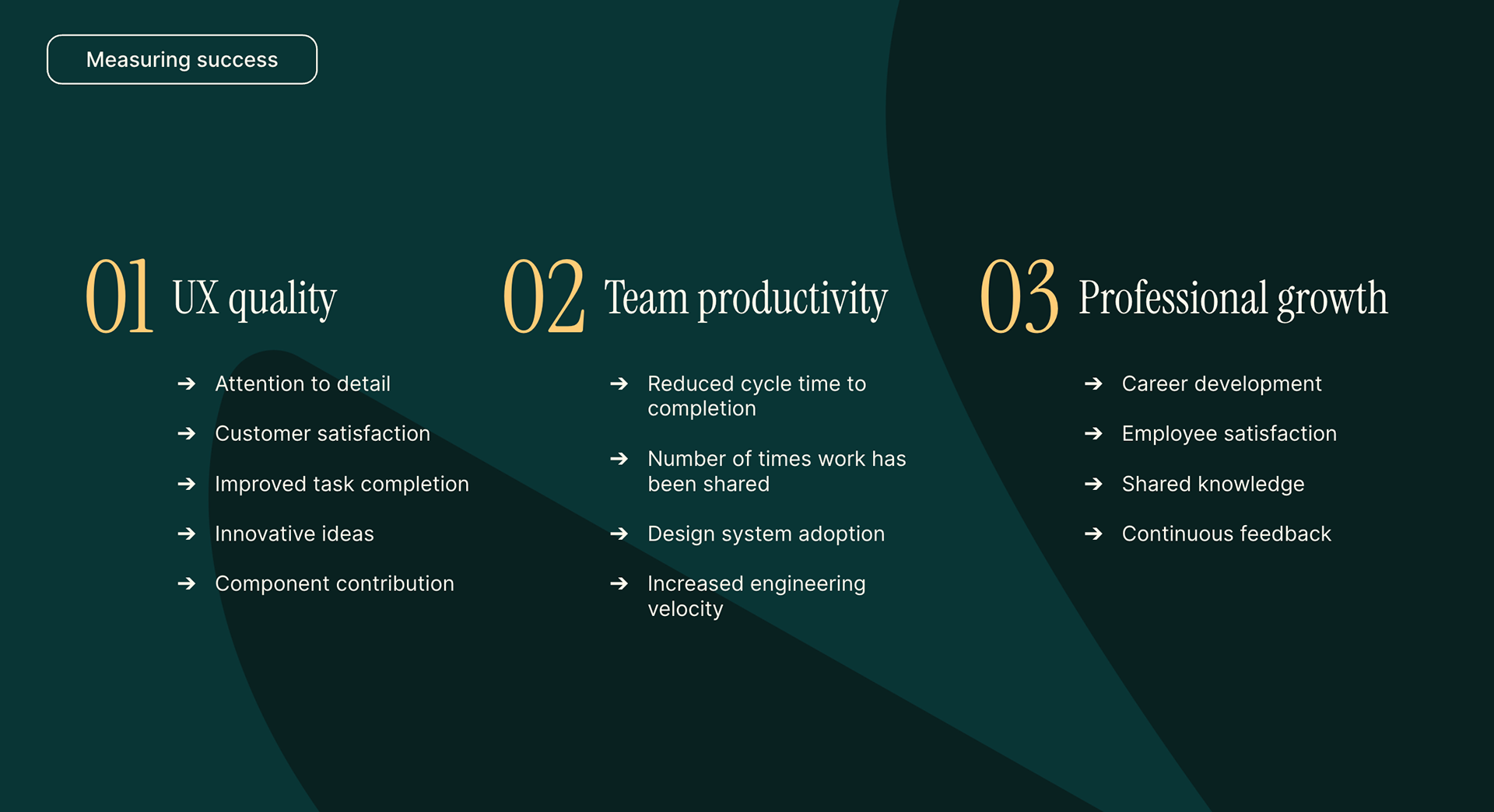
Success metrics for the design team include attention to detail, innovative ideas, customer satisfaction, task completion rates, design system adoption, and continuous feedback, all contributing to high-quality user experience.
Last year, we ratified our Design Mission: We exist to craft the experiences that empower practices to deliver quality care – this mission was created in a bottom-up way to ensure Designers feel more invested in its success and are more likely to champion it. It also allowed us to work collaboratively on a shared goal, which helped boost morale. Overseeing my team and managers' workshop this mission helped me identify leadership potential and areas for development very early on in my role here… we ran this workshop in March of 2023.
The Design Mission crafted to empower practices to deliver quality care is rooted in collaborative efforts, fostering a sense of investment and ownership among designers.
The mission centers around how the design function can uniquely deliver “empowering craft” for our clinician customers. This means we provide simple and elegant solutions yet powerful and create efficiencies in their workflows.

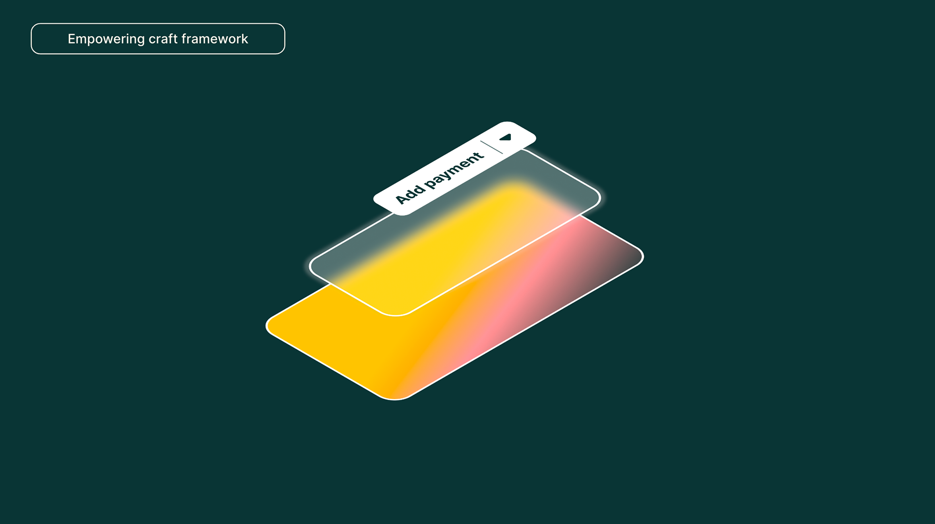
A framework for organizing UI elements promotes using reliable components to ensure efficient load times, context-specific design to minimize user distractions, and brand expression to differentiate and add value.
To show the team how our mission manifests in practice… I created a framework that helps our team become more intentional about organizing UI elements. This, in turn, enables us to live up to the promise of “empowering craft.”
The framework starts with using proven, reliable components from our central design system, minimizing tech debt and load time for the customer, and leveraging data-backed best practices.
Those components should then be nested in context-specific containers. By containing components, patterns, and full workflows in specific parts of the UI, we’ll minimize context switching and distractions. Which, in turn, helps improve metrics like time to completion and completion rates.
Finally, we want our team to leverage the delight and swagger of our brand expression throughout the user experience. In the same way that Mailchimp's playful tone and quirky illustrations inject fun into their email marketing platform, or Airbnb's emphasis on local experiences and UGC creates a unique and delightful travel booking experience – allowing the updated SimplePractice brand with its Encouraging, Warm, and Informative verbal identity and optimistic and trustworthy palette – will help us achieve more robust market differentiation, and increase perceived value and willingness to pay.

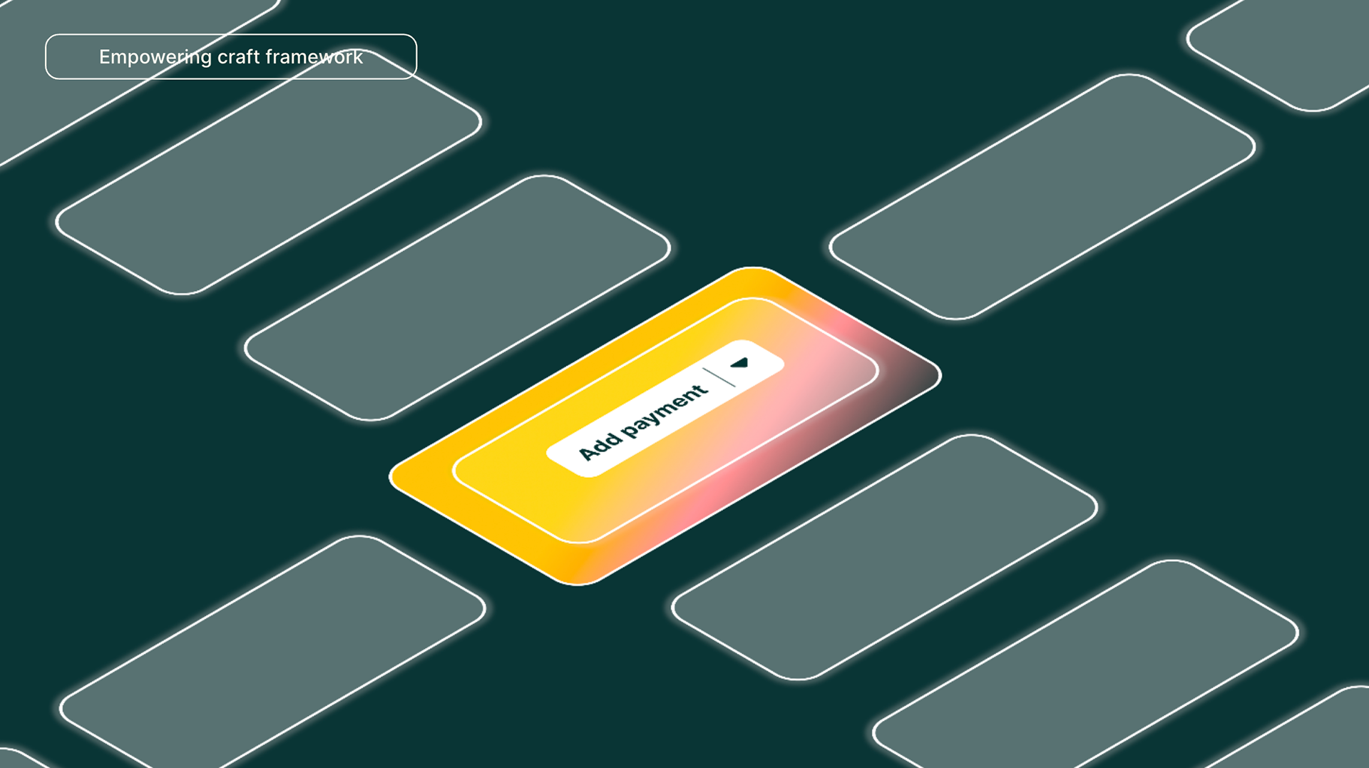
This is a VisionType I created to help the team see the framework in action. A clearly defined and sectioned navigation or control center helps with wayfinding. Using the movement of our sections in and out of view to help set context and improve focus. A modern glass blur effect will help us show our clinicians clearer elevation and hierarchy, plus allow our brand to shine through. This is not a literal direction I want the team to deliver… more of a reference for the quality bar I want to challenge them to meet.
VisionType is a conceptual tool used to envision the framework in action, emphasizing clear navigation, contextual awareness, and a unique brand identity to elevate user experience.
Similar to how our design principles reflect HOW we work and WHAT we aim to deliver, we have four pillars that power how we do UX work at simplepractice and give us a competitive edge.
Our investment in design has driven our rise above the competition, allowing us to charge a premium for a well-designed experience that our competitors can't match.
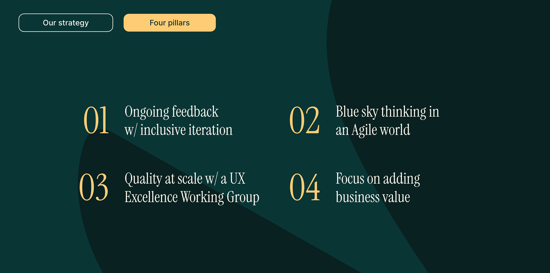
The four pillars for UX work involve gathering comprehensive user feedback, enabling big design ideas within agile frameworks, maintaining quality through UX governance, and ensuring that stellar UX aligns with business value.
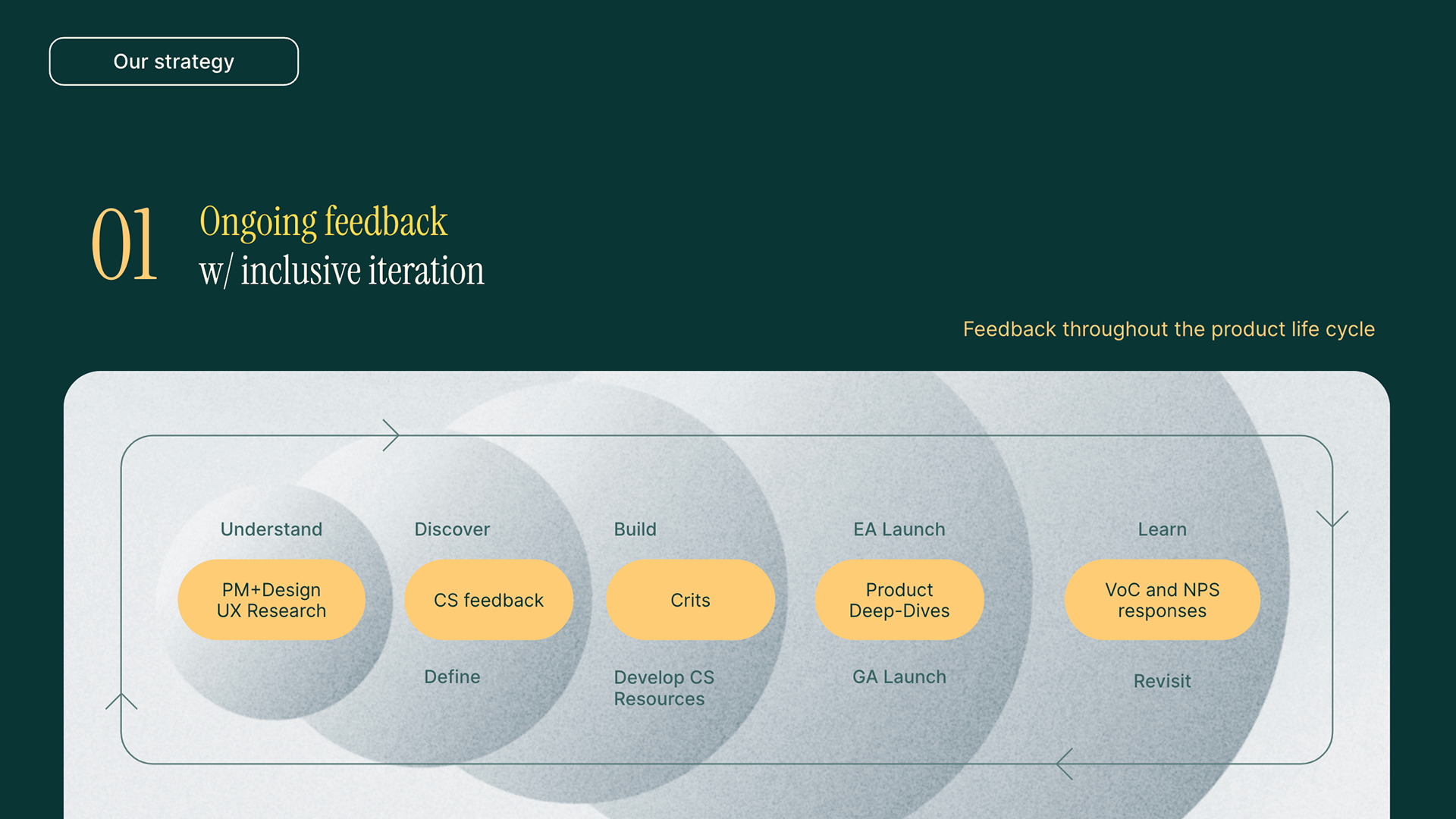
The first pillar has two parts: gathering user feedback and revisiting and iterating on designs. To gather user feedback more thoroughly, I want our team to look across the product life cycle, from the early “understand it” and “think it” phases to the middle “build it” phase and the later “learn and tweak it” phase.
During the early stage, we use PM and Designer pairings where they go broad to explore the challenge space, then narrow and align on the priority of the customer challenges to solve.
In the middle stage of our product lifecycle, we leverage bi-weekly product deep dives with cross-functional leads, which helps validate our approach and ensure designs are aligned with strategic or business goals. To administer a broader set of stakeholders learn from our user feedback and quant measures, we use a monthly Hour of Learning venue to which all teams are invited.
Understanding our customers in the “tweak it” or latter product lifecycle stage, we leverage our “voice of the customer” slack channels daily to help us stay connected after we ship the solution and need to learn and revisit.
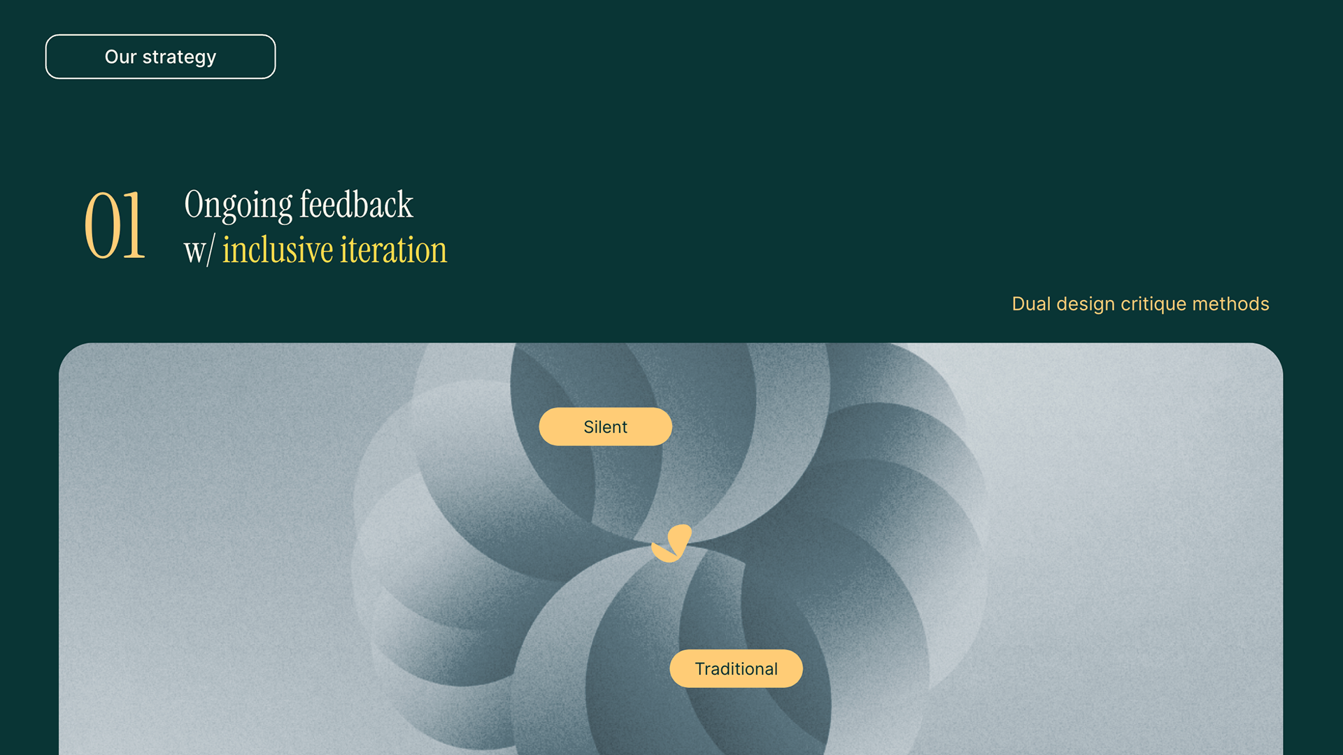
For how we revisit or iterate… we subscribe to the Two-Pronged Approach for achieving Stellar Design.
Imagine getting two sets of fresh eyes on your design: one broad and diverse, the other focused and experienced. That's the beauty of combining silent and traditional critiques – Silent crits can be used to identify major issues, then traditional design crits to refine solutions. They also balance anonymous feedback with opportunities for learning and exploration.
With both, we’re able to capture both broad impressions and specific details from diverse viewpoints, we’re able to identify issues while ensuring solutions are well-considered and user-centered quickly, and we can foster creative thinking while providing growth opportunities.
With both, we’re able to capture both broad impressions and specific details from diverse viewpoints, we’re able to identify issues while ensuring solutions are well-considered and user-centered quickly, and we can foster creative thinking while providing growth opportunities.
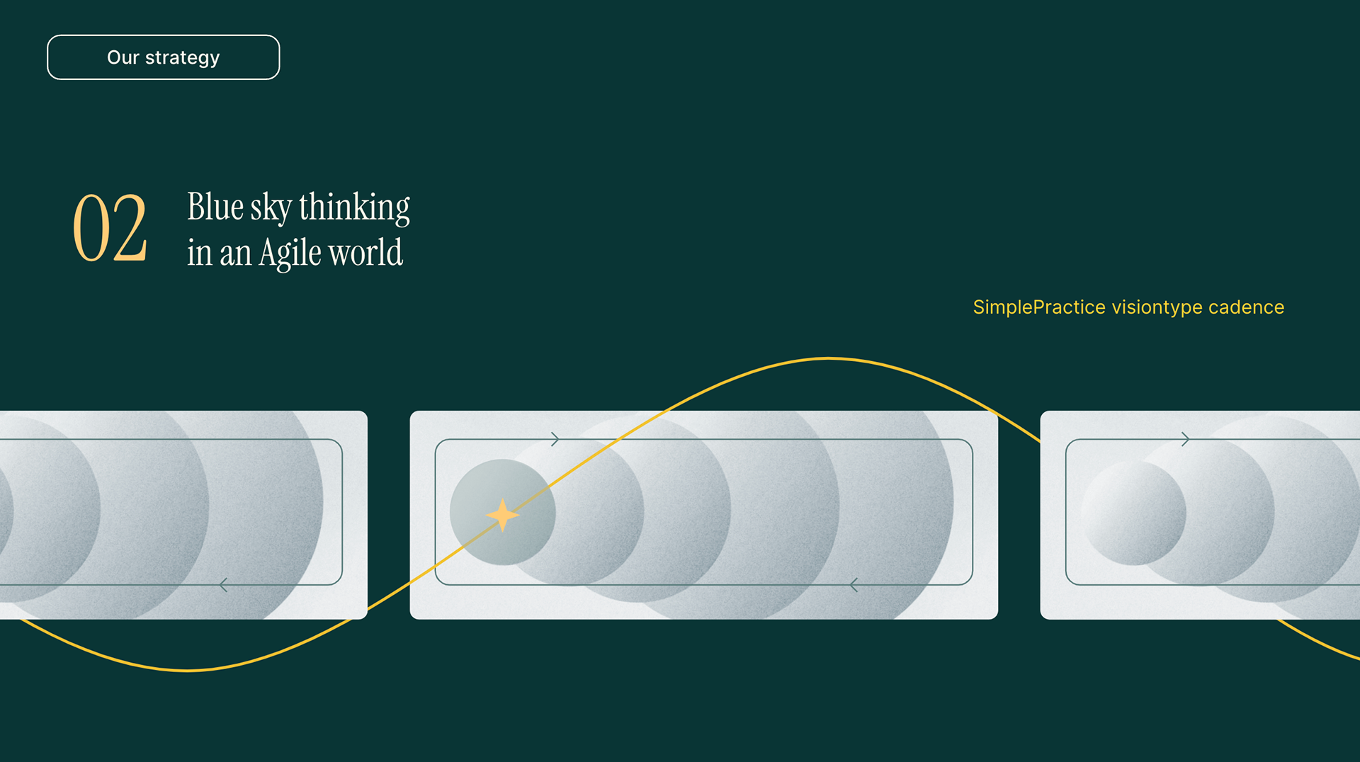
Our second pillar allows us to deliver big design ideas continuously without derailing or slowing Agile processes.
Agile methodologies with iterations and user feedback loops are generally considered more suitable for fostering creativity and delivering high-quality UX. Still, the condensed, back-to-back Sprint windows can leave designers little space for future-facing work or blue-sky thinking.
Our VisionType cadence counteracts this… not always, but often enough so that we have design explorations that we can tap into and enhance the early stages of our product work. So, by creating space for our designers to go broad with ideation, untethered to roadmap-specific work, we’re giving our product teams a library of components and patterns that help pull the experience up to a higher level of quality.
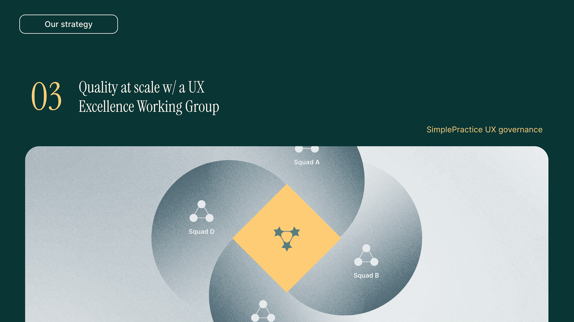
Our third pillar helps us design quickly at scale, with autonomous teams through a governance layer we call the UX Excellence working group – composed of folks who do this work in addition to their roles within squads.
Similar to how I saw Spotify ensure stellar UX across their squads and tribes structure, our product org emphasizes alignment and support through clear guidelines and regular communication delivered by PM, Tech, and Design SMEs.
So while squads operate as mini-startups with end-to-end ownership of their assigned area – which empowers them to make decisions independently, fostering a sense of ownership and accountability – our UXE group defines and keeps guidelines updated across accessibility, clinician UX excellence, client UX excellence, and native mobile standards. These senior SMEs also attend regular design critiques to provide input and expertise during the “define” and subsequent stages to push and ensure our standards are being considered and ultimately met. In addition, we are exploring how they can be available to help brainstorm and tackle more complex product gaps or needs that arise.
Our criteria for selecting these folks ensured we had Senior II or lead level, representative of CS + PD ratios across design, and someone from each experience.
Our fourth pillar is based on an idea I proved out leading design teams at Intuit… in the idea that stellar UX can be both customer obsessed and deliver business value. Part of our secret sauce is our investment in Content Design resources.
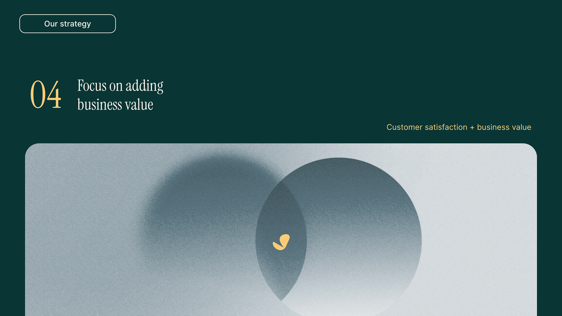
Investing in content design enhances the user experience, communication strategy, and navigation of complex information, positioning SimplePractice as a premium product in the market.
We aim to have a minimum of 4 developers and up to 10 in any squad.
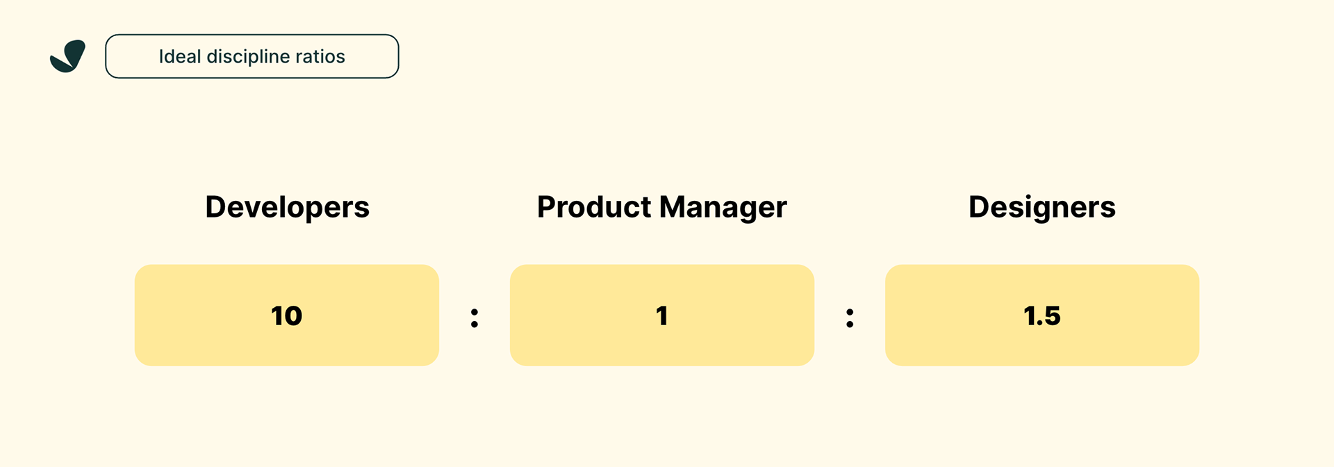
By the way, this puts our Designer to Developer ratio within range of where most B2B SaaS companies are based on this survey from Nielsen Norman Group back in 2020.

Digging a little deeper into our 1.5 designer-to-developer ratio, the breakdown is for every Product Designer, we aim to employ the talents of ½ Content Designer.

The rationale for this is best reflected in this quote: "People don't just buy products; they buy stories." But there’s more about why we invest in Content Design Staffing.

SimplePractice is one of the most expensive EHRs in our segment, so we need to demonstrate the value customers get from our product as soon as they land in it. Content Design expertise in communication strategy helps us land value-based messaging in a voice that resonates with our target customers. This comes to life with our onboarding, trialer, and upsell experiences.
Considering our customers are highly educated, emotionally intelligent people, they tend to pay close attention to the communication they get from us. When we communicate poorly, it impacts customer retention and their desire to recommend SimplePractice. Content designers build bridges with words through voice and tone explorations and customer-centered language research. They flex these muscles and help us drive feature usage, design messaging through the customer journey, and communicate bad news.
Lastly… we’re in a highly regulated industry with layers of risks, from financial obligations to compliance requirements. Content designers help customers navigate complex information quickly and protect the company with clear communication about security and privacy. Because of this, they can help us create efficient product flows, deliver clear information architecture, and accurately label and analyze data.

Without diminishing the stellar work of our product designers, our small but mighty content design team helps us fortify our UX foundations because we hire for solid technical UX skills.
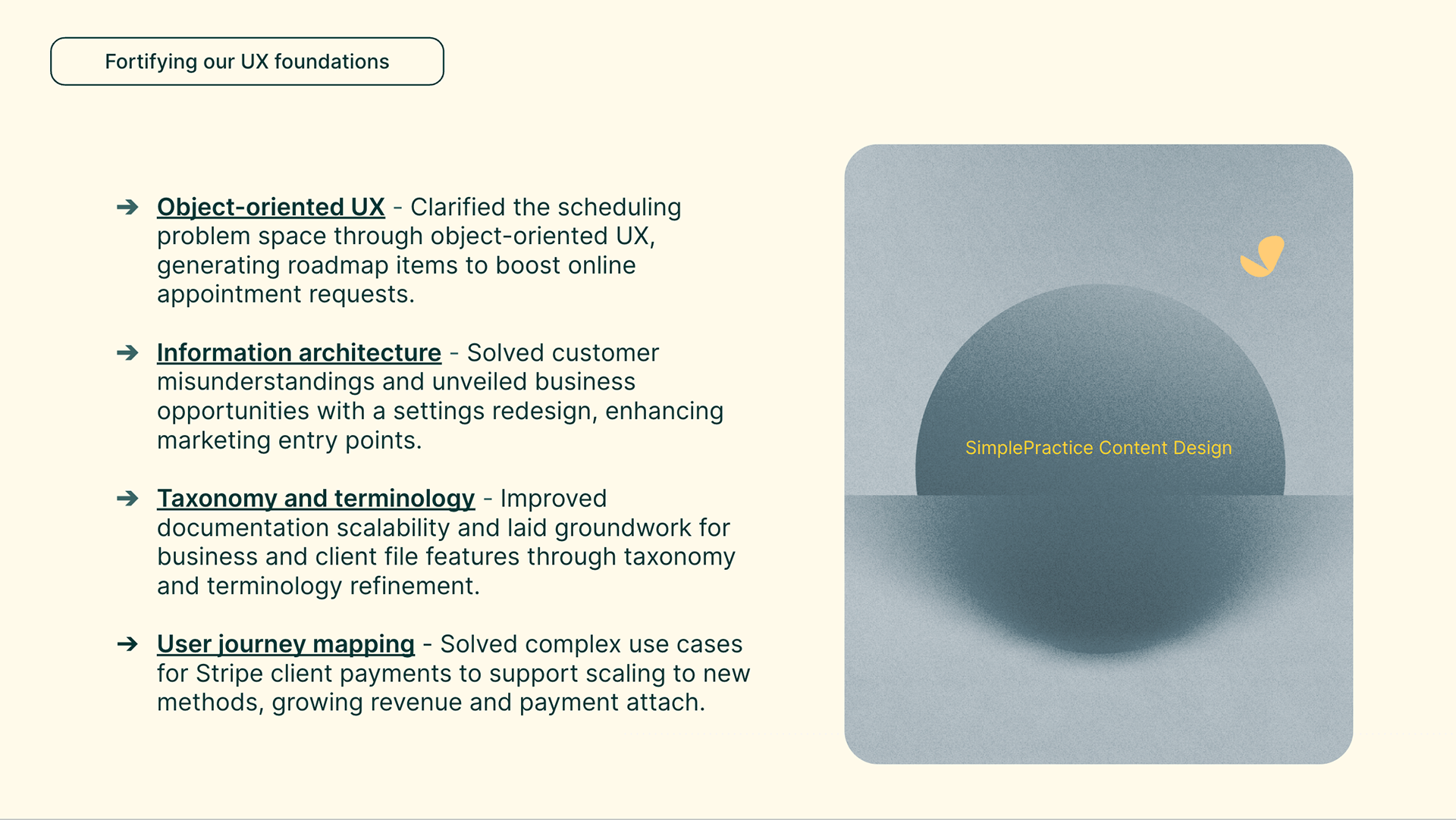
In content design, we hire for world-class Object-oriented UX experience – which has served us well as it clarified the scheduling problem space and generated roadmap items to drive usage of online appointment requests.
In content design, we hire for world-class Object-oriented UX experience – which has served us well as it clarified the scheduling problem space and generated roadmap items to drive usage of online appointment requests.
We also look for incredible Information Architecture skills, which, in the settings redesign, solved underlying customer misunderstandings and created business opportunities by better surfacing marketing entry points.
Deep taxonomy and terminology experience is also crucial: We saw this value most recently with work across the documentation journey, which set us up to scale to new specialties and laid the foundation for core feature work on "Business Files" and "Client Files" surfaces.
We also looked for solid User Journey Mapping abilities, which paid off when mapping the journey for Stripe payment processing and unblocked the billing and payments team to scale to new payment methods.
Similar to “Pair Programming” – a software development technique in which two programmers work together at one workstation – the unique pairing we do with Content Designers and Product Designers at the squad level allows for similar gains. In pair programming, you have one driver (the person writing code) and one observer or navigator who reviews each line of code as it’s typed in. The two programmers in this technique switch roles frequently.
So, for SimplePractice Design, while reviewing Product Design explorations, the Content Design observer considers the strategic direction of the work, ensures high verbal craft, and helps come up with ideas for improvements and corner cases to address. This helps the driver focus more on the tactical aspects of completing the work for that design sprint, using the observer as a safety net and guide.

Lastly, I’d like to talk about our current state of UX Research… which isn’t quite where we’d like to see it. While our Product and Designer pairs conduct solid UX research, it’s inconsistent from one squad to the next and lacks the connective tissue for shared learning at scale. Similarly, our PMM partners do great, long-term studies, but the findings don’t always return to the product consistently or reliably. We even started doing UX research on our marketing surfaces with a contractor resource, bringing AB testing and user-centricity to the top of our funnel. But, again, it’s disconnected from product and data science, so the broader team may not leverage insights.
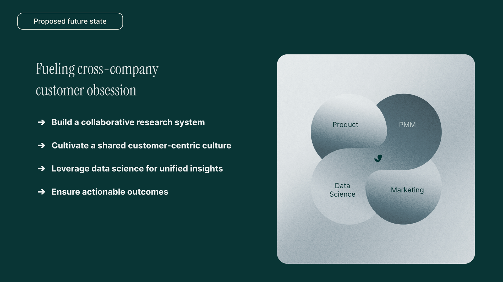
The company aims to establish a unified UX research approach that integrates across teams and departments, focusing on building a collaborative system, cultivating a customer-centric culture, leveraging data science, and ensuring actionable outcomes.
I see an opportunity to fuel cross-company customer obsession if we:
Build a collaborative research system:
Shared research hub: Easy access to insights and artifacts.
Regular cross-company meetings: Discuss findings and plan initiatives.
Standardized reporting: Clear, comparable insights across teams and organizations; shared data visualization system to improve comprehension
Cultivate a shared customer-centric culture:
Emphasize user empathy: Encourage and incentivize active engagement with clinicians.
Comprehensive customer journey map: Visualize pain points and opportunities thoroughly using our "jobs to be done" (JTBD) framework as a foundation.
Regular internal communication: Share customer stories, data, and feedback.
Leverage data science for unified insights:
Consistent data in a holistic data ecosystem. We’ll better ship the right features when we integrate data from various sources, extract deeper insights from combined datasets, and do more predictive modeling to anticipate customer needs for personalized experiences.
Ensure actionable outcomes:
Prioritize research based on impact: Align with business goals.
Translate findings to action: Clear next steps for teams.
Track and measure impact: Quantify the value of research efforts.