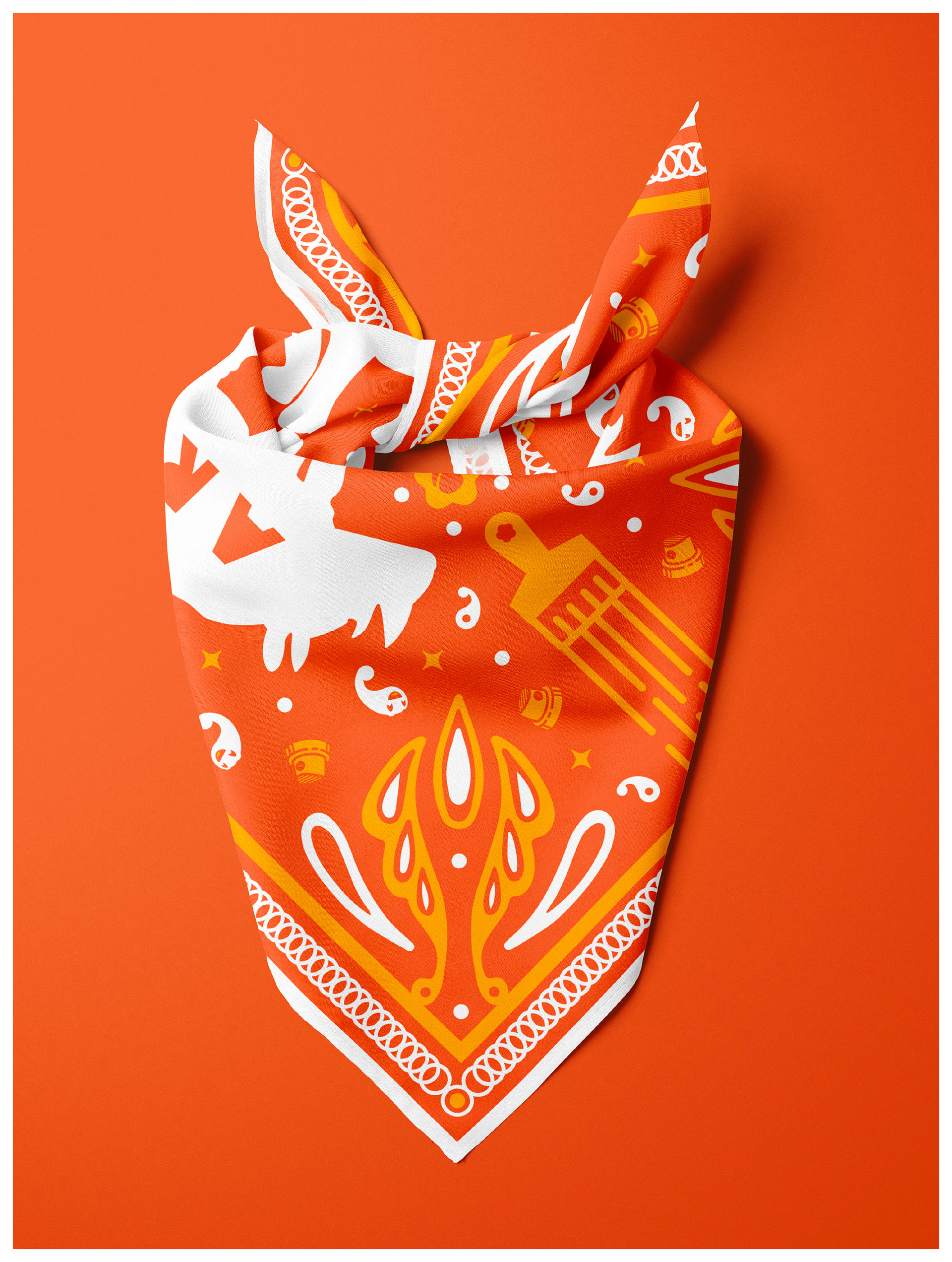
Illustration, Print Making
As someone who fell in love with street and graffiti art at a young age, Denver's River North (RiNo) Art District serves as my hometown art mecca. Over the past twenty years, this neighborhood has evolved into a hub of creative urban charm and industrial renewal, featuring outstanding restaurants, jazz bars, brewpubs, art galleries/studios, and year-round creative events.
I frequent this neighborhood on every trip home, photographing work that moves me—specifically from artists who've inspired my lettering and illustration styles. Murals from Mike Graves, Tuke, Emit, Easto, and Scribes from the DF/ATT/Creatures crew hold particular significance in my artistic journey.
When RiNo Arts District called for designs to adorn member artists' bandanas, I jumped at the opportunity.

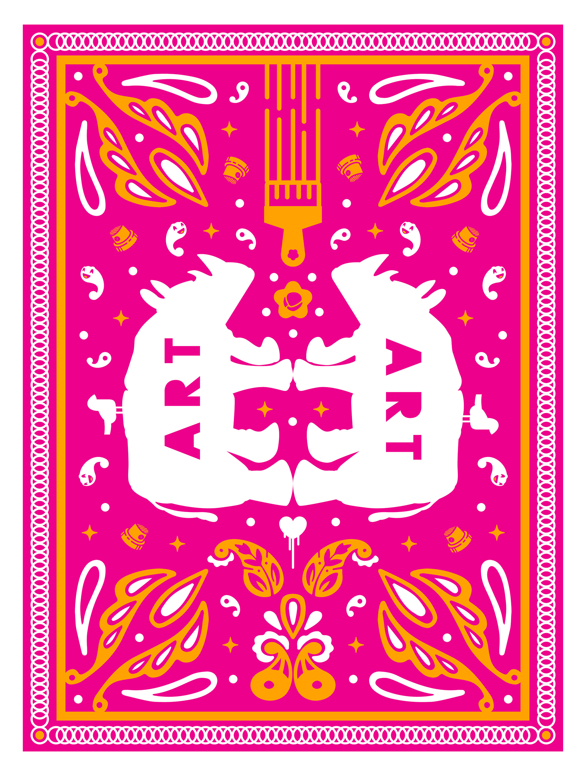

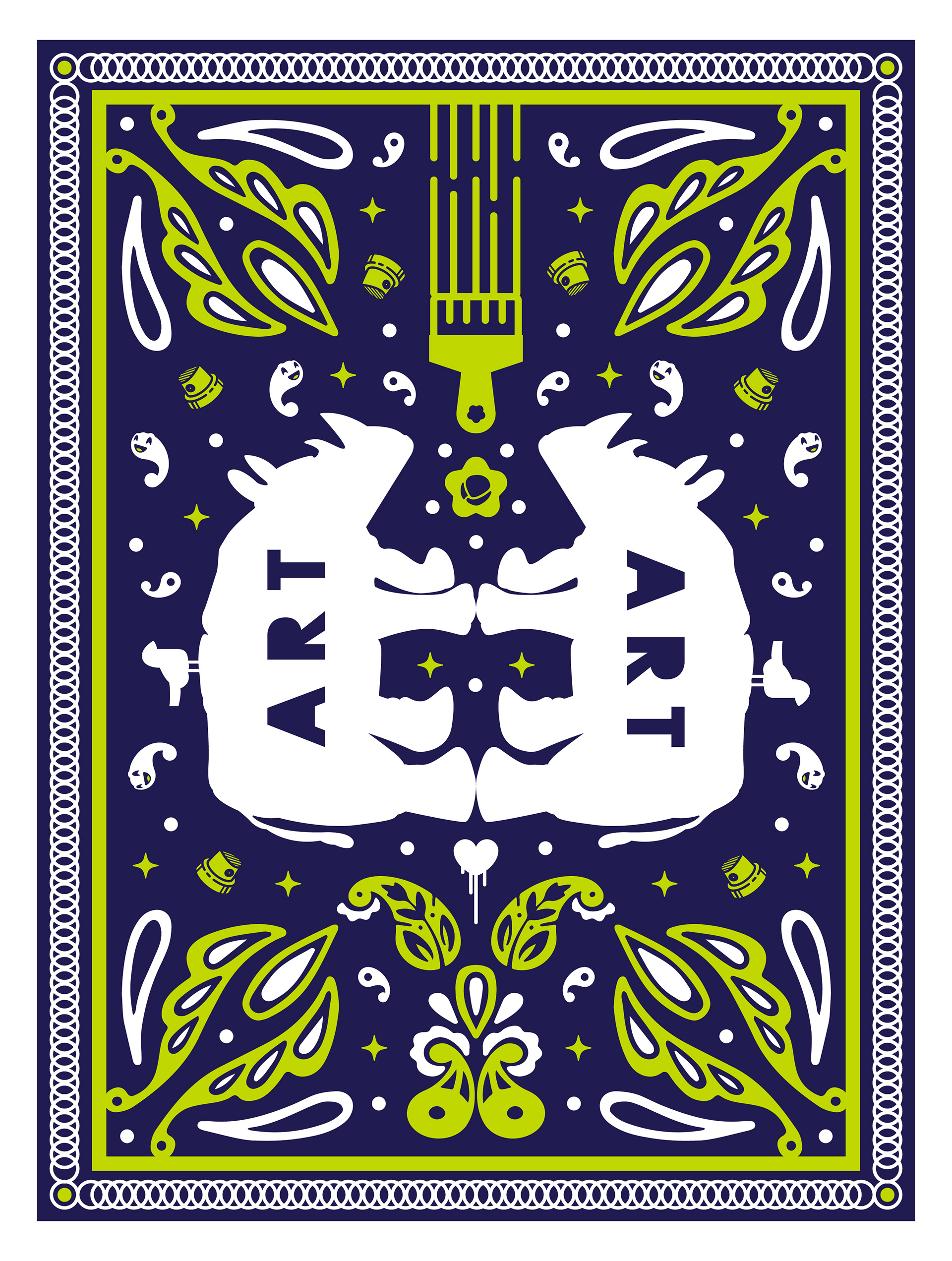


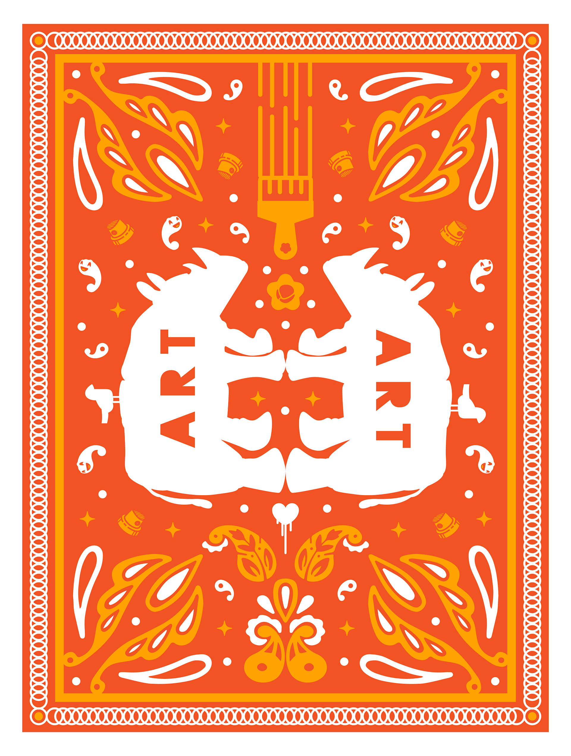
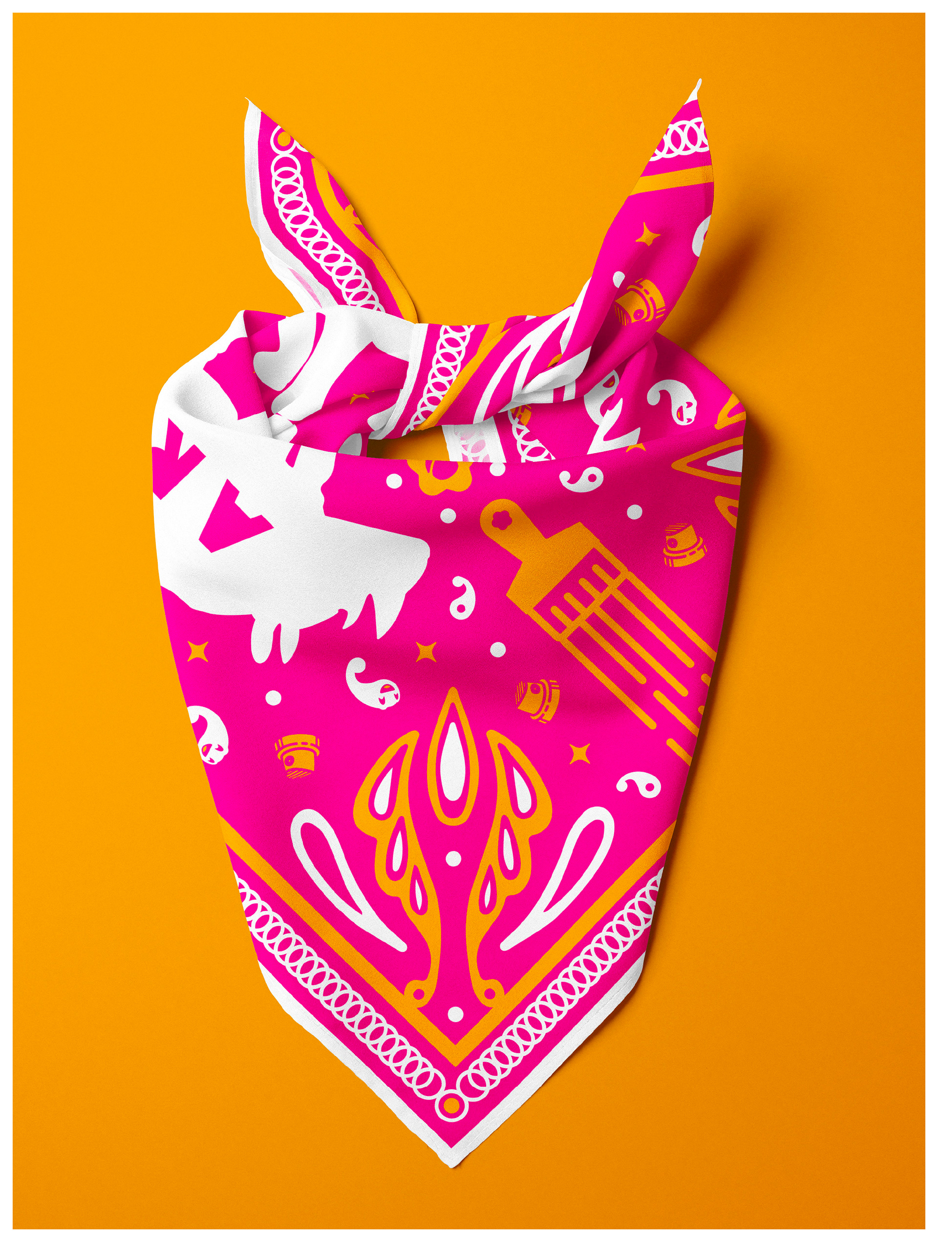
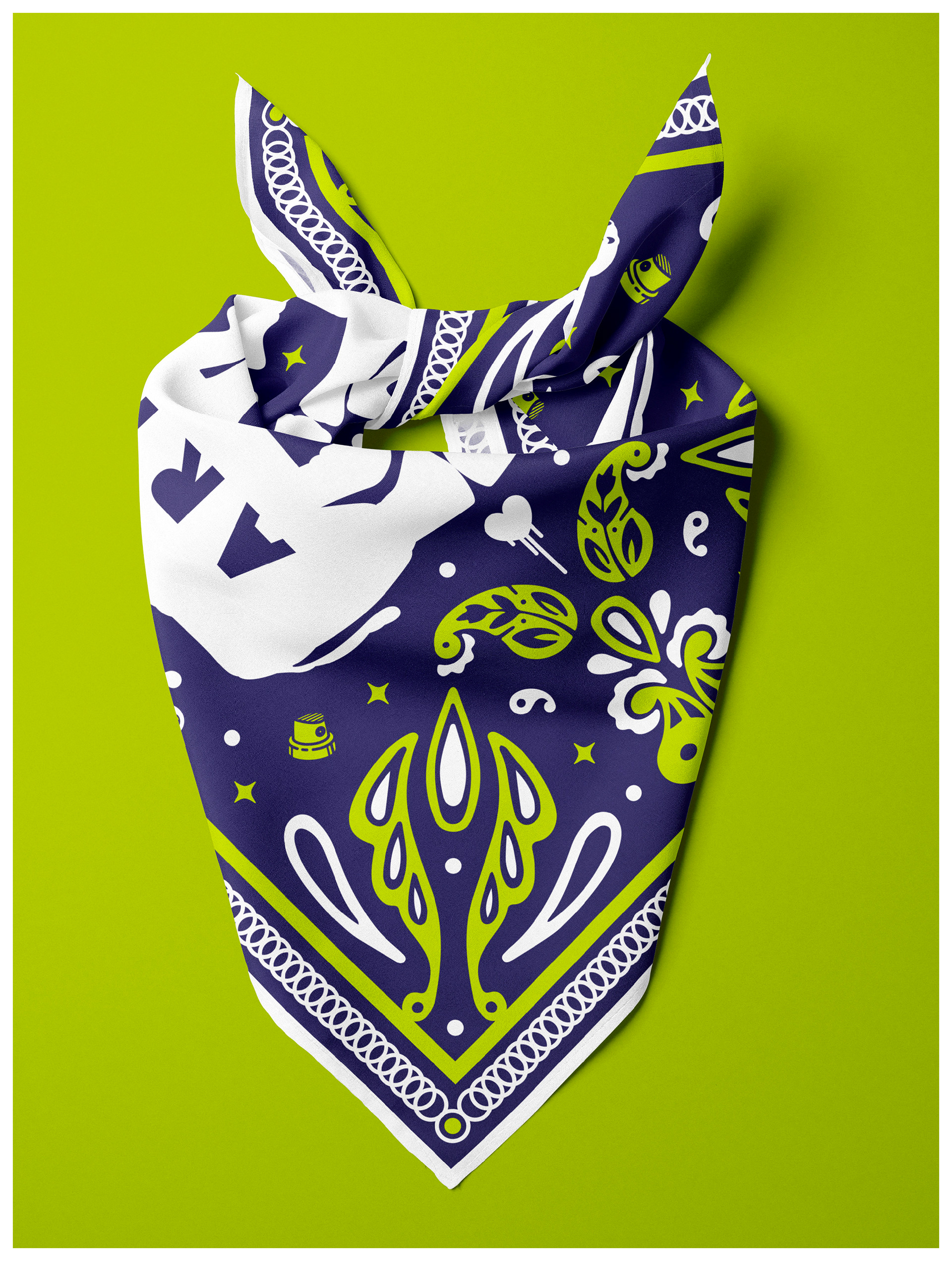
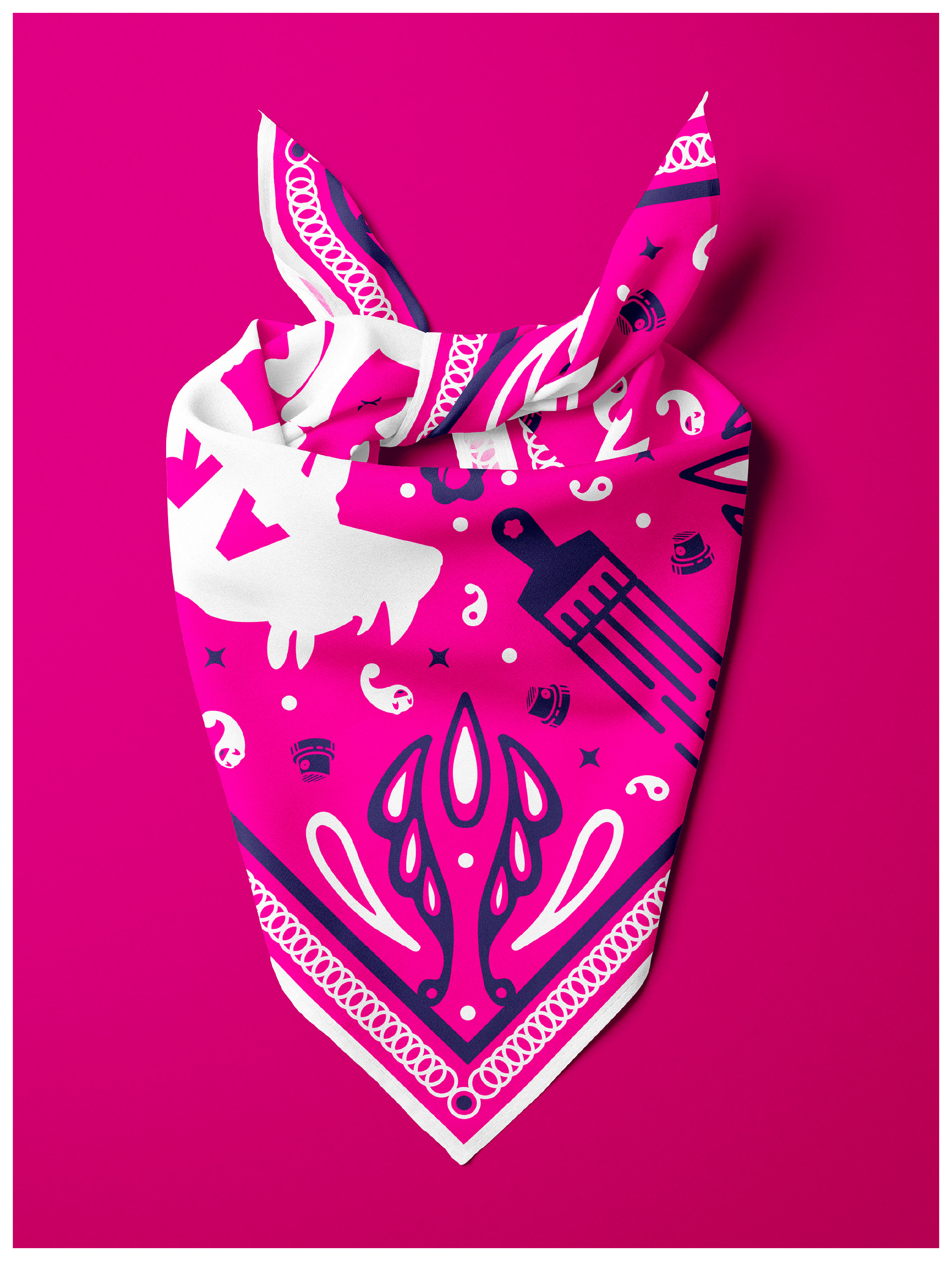
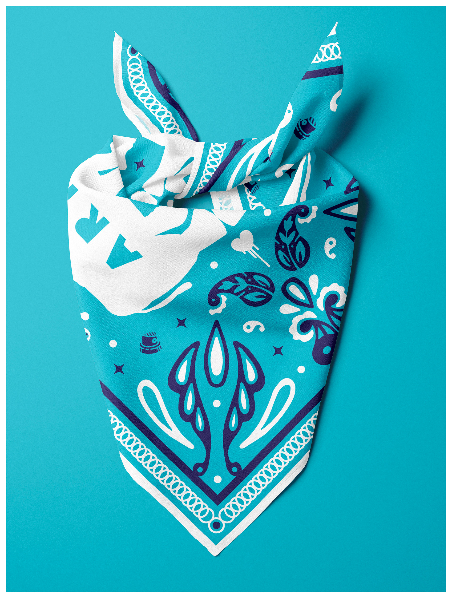
I began my design exploration with a strong point of view of creating a design that balanced high fashion and approachability. A design that blended a traditional paisley-filled bandana that resonates with working-class creatives -- with a palette that felt premium and strikes a chord with fashion-forward creatives.
With that in mind, I found a well-designed Vincent De Paul Biltmore Renaissance Revival Pocket Square with a reflected animal pattern. I started my design work with this layout as I felt it would work well with the rhinoceros + bird logo RiNo Arts District uses as its primary mark.
With that in mind, I found a well-designed Vincent De Paul Biltmore Renaissance Revival Pocket Square with a reflected animal pattern. I started my design work with this layout as I felt it would work well with the rhinoceros + bird logo RiNo Arts District uses as its primary mark.
The spray can caps and paintbrushes in the design nod to the tools these incredible artists use to share their talents with the world.
Just below the paintbrush, there's also a hat tip to the Montana Colors (MTN) paint company, which has supported graffiti artists since the early 1990s and helped advance spray can/aerosol technology to meet the growing skillset of mural artists.
Just below the paintbrush, there's also a hat tip to the Montana Colors (MTN) paint company, which has supported graffiti artists since the early 1990s and helped advance spray can/aerosol technology to meet the growing skillset of mural artists.
The small, imperfect heart near the center of the bandana reflects my passion for graffiti art. The drips coming down from it are meant to reflect the "bleeding heart" sympathy that graffiti artists have for the misfortunes of their beloved inner-city neighbors. ✨💖✨
Despite being limited to two colors, the vibrant palette provided by the RiNo Art District team gave me ample space to bring the design to life in multiple strong colorways. But I'd be remiss if I didn't share that my favorite uses the vibrant primary orange from the RiNo logo and a deep blue from their secondary palette. Go Broncos!
