
Point of View
AI products in conservative domains like tax and finance only work when the interface feels like an instrument panel. People need to see how the system thinks, where the numbers come from, and what they can rely on when the stakes are high.
That was my lens for Neo.Tax: design a homepage and system that gives founders, finance leaders, and accountants the same feeling they get from a well-built financial model, then wrap it in a visual language that feels modern, credible, and human.
Context
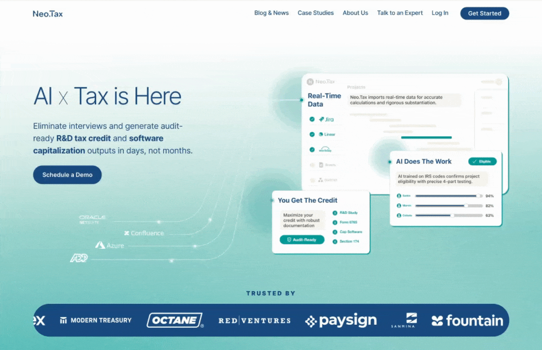
Neo.Tax helps startups and small companies turn painful R&D tax credits and software capitalization rules into real money in the bank. The product is serious: an AI engine that encodes tax methodology, connects to the tools teams already use, and surfaces audit-ready outputs.
The site did not match that reality.
The product story was buried in dense paragraphs.
Visuals leaned into “experimental SaaS” aesthetics, which made finance-oriented buyers skeptical.
The hero never showed real product outputs, so evaluators had to work to understand what they were buying.
The value prop was strong. The design had to catch up.
My Role
I joined as a hands-on design partner to founder Ahmad Ibrahim and the core team.
Role: Lead product designer and storyteller
Partners: CEO Ahmad Ibrahim, CTO Firas Abuzied, PM Nicole
Scope: Homepage, About, Blog & News, Talk to an Expert
Ownership:
Value prop framing and narrative
Visual system, layout, typography, and interaction patterns
Motion concepts and Lottie-ready specs
Componentization and dev handoff for the in-house team
This was not an advisory engagement. I was in Figma, working on cards, gradients, type scales, and micro-alignment until the page felt as rigorous as the underlying tax engine.
The Real Challenge
We were going beyond “refreshing the homepage” and were trying to solve a layered problem:
Earn trust with tax and accounting buyers who default to skepticism when they sense hype.
Signal technical credibility to engineers and finance leaders who care about how data flows through the system.
Lower cognitive load at first glance while still giving expert evaluators enough depth to dig in.
Respect real constraints: a lean internal team, staged rollout, and a requirement to reuse the existing site architecture.
Everything needed to work within those limits and still feel premium.
Principles That Guided The Redesign
Before touching pixels, I aligned the work around a few simple principles:
Show the engine, not a vibe
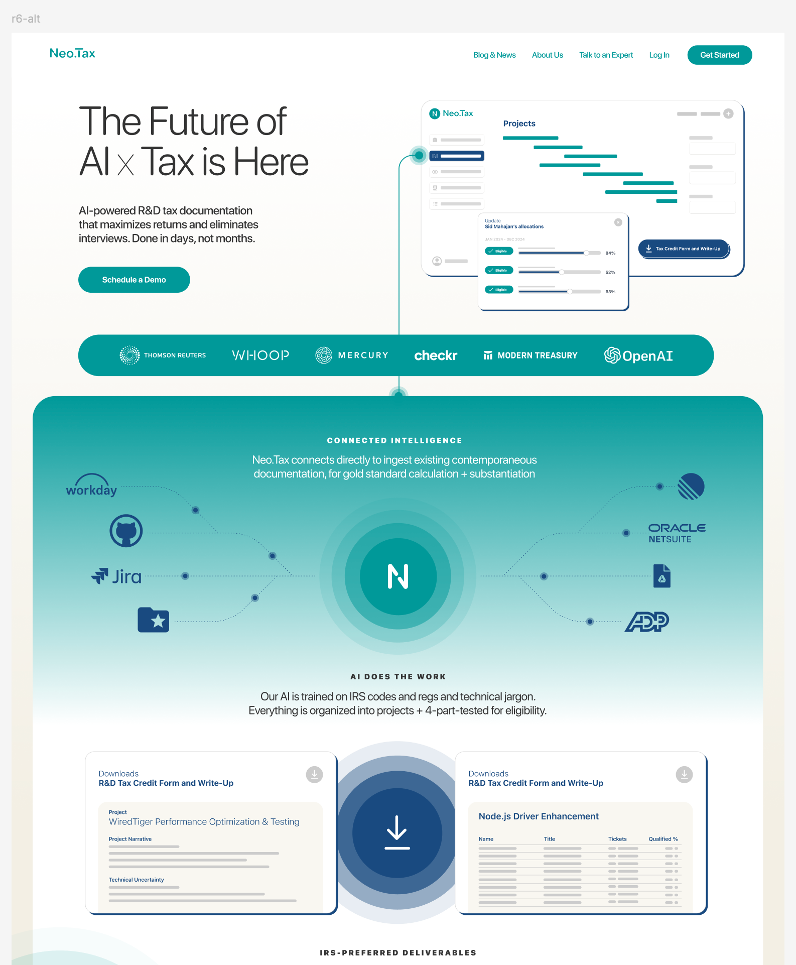
The hero needed to show real product structures and outputs, not abstract illustrations. The page should make the AI engine legible.
The hero needed to show real product structures and outputs, not abstract illustrations. The page should make the AI engine legible.
Design for auditors, founders, and operators at the same time
Each audience cares about something slightly different: defensibility, time saved, money back. The layout and copy needed to speak to all three without turning into a wall of text.
Each audience cares about something slightly different: defensibility, time saved, money back. The layout and copy needed to speak to all three without turning into a wall of text.
Treat the homepage like a connected narrative, not a stack of sections
A visitor should scroll and feel a single argument unfolding: what Neo.Tax is, how it works, why it is safe to trust, and what to do next.
A visitor should scroll and feel a single argument unfolding: what Neo.Tax is, how it works, why it is safe to trust, and what to do next.
Ship a system, not a one-off hero
Every pattern in the hero should extend cleanly into About, Blog, and future product storytelling so the team could keep evolving without redesigning from scratch.
Every pattern in the hero should extend cleanly into About, Blog, and future product storytelling so the team could keep evolving without redesigning from scratch.
Design Evolution, In Service Of That POV
The final layout at the top of the case study sits on top of many rounds of exploration. Those rounds were not just aesthetic experiments, they were ways to test how the brand could hold that original point of view.
Round 1, Exploring the Edges
I started intentionally wide:
Purple Nebula: Deep purples, cinematic gradients, and glows that leaned into AI “magic.”
Cyber Green: Higher contrast, almost terminal-like, signaling a very technical product.
Neo Classic: A lighter teal gradient direction that started to feel more financial and grounded.
The composition stayed consistent: a central product card stack with orbiting nodes that implied data inputs and outputs. Only palette and mood changed. This let us test how far we could push the brand without breaking trust or legibility.
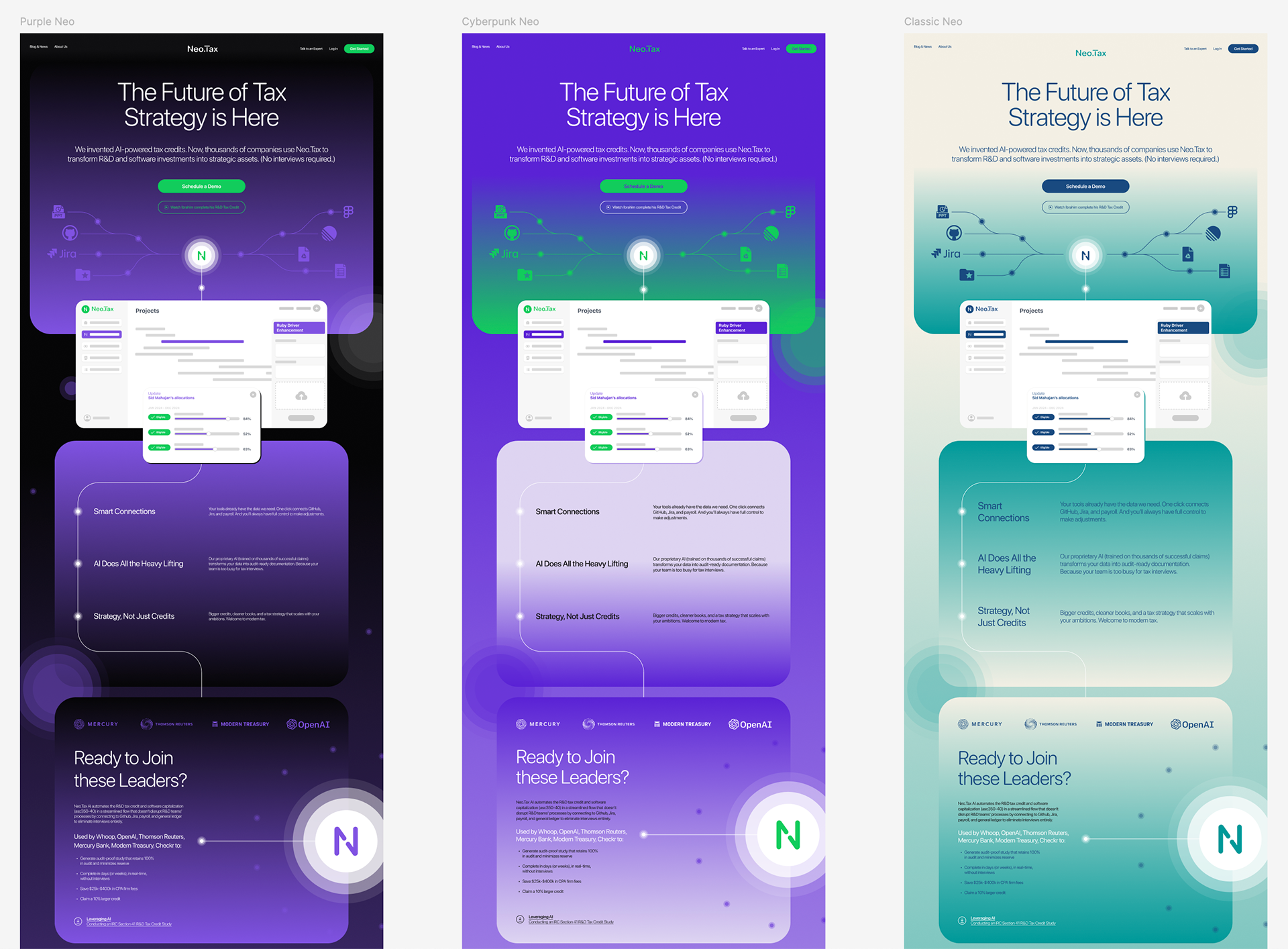
What we learned: Tax and accounting buyers have a low tolerance for anything that smells like crypto or speculation. The purple direction crossed that line.
Round 2, Using Palette To Signal Maturity
We pivoted the core palette to a confident navy that frames Neo.Tax’s bright teal gradients. That single decision did a lot of work:
Grounded the brand in a visual language closer to established financial products.
Created a strong contrast environment for white product cards, charts, and data.
Gave us range from “calm compliance” to “bright AI energy” within one cohesive system.
This is a good example of how I use color as a strategic lever, not just a decorative one.
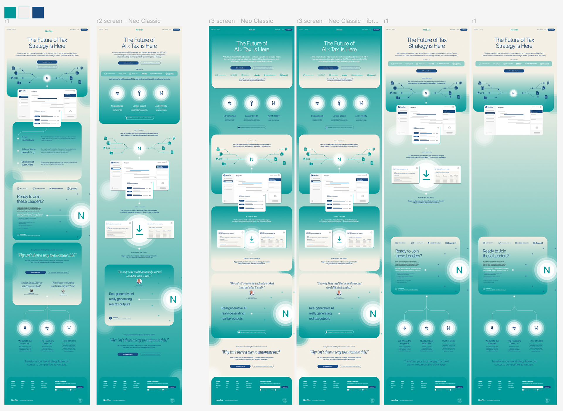
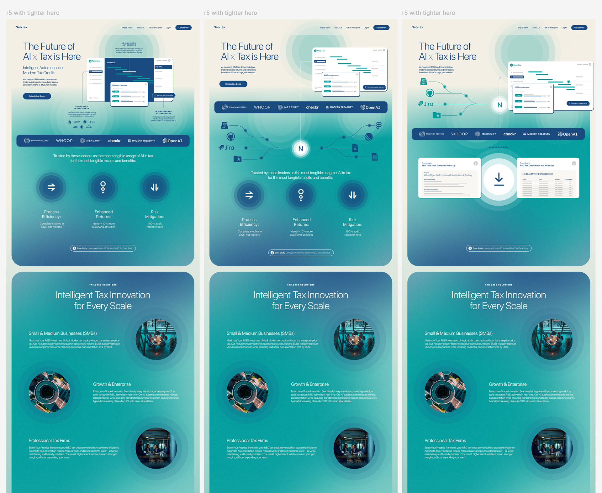
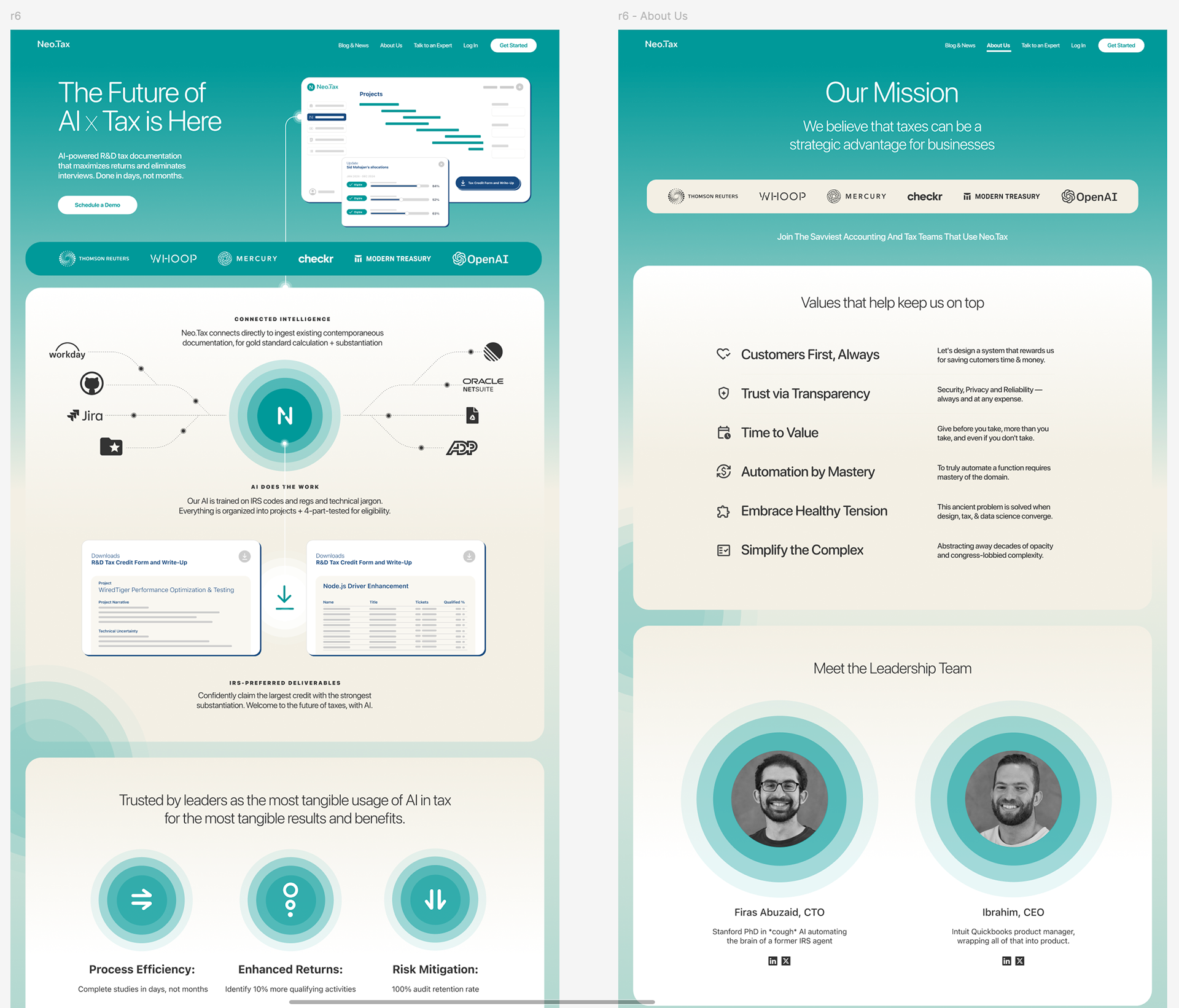
Round 3, From Hero Comp To Page System
Once we had the palette, I zoomed out to a full page:
Reused the hero card and “N” icon as a visual anchor that carries through the page.
Introduced a horizontal connecting line that ties together partner logos and integration icons, making Neo.Tax feel like the center of a company’s data stack.
Tightened vertical rhythm so the scroll feels like a single narrative instead of independent sections.
Here the work shifted from “great hero” to “cohesive homepage system.”
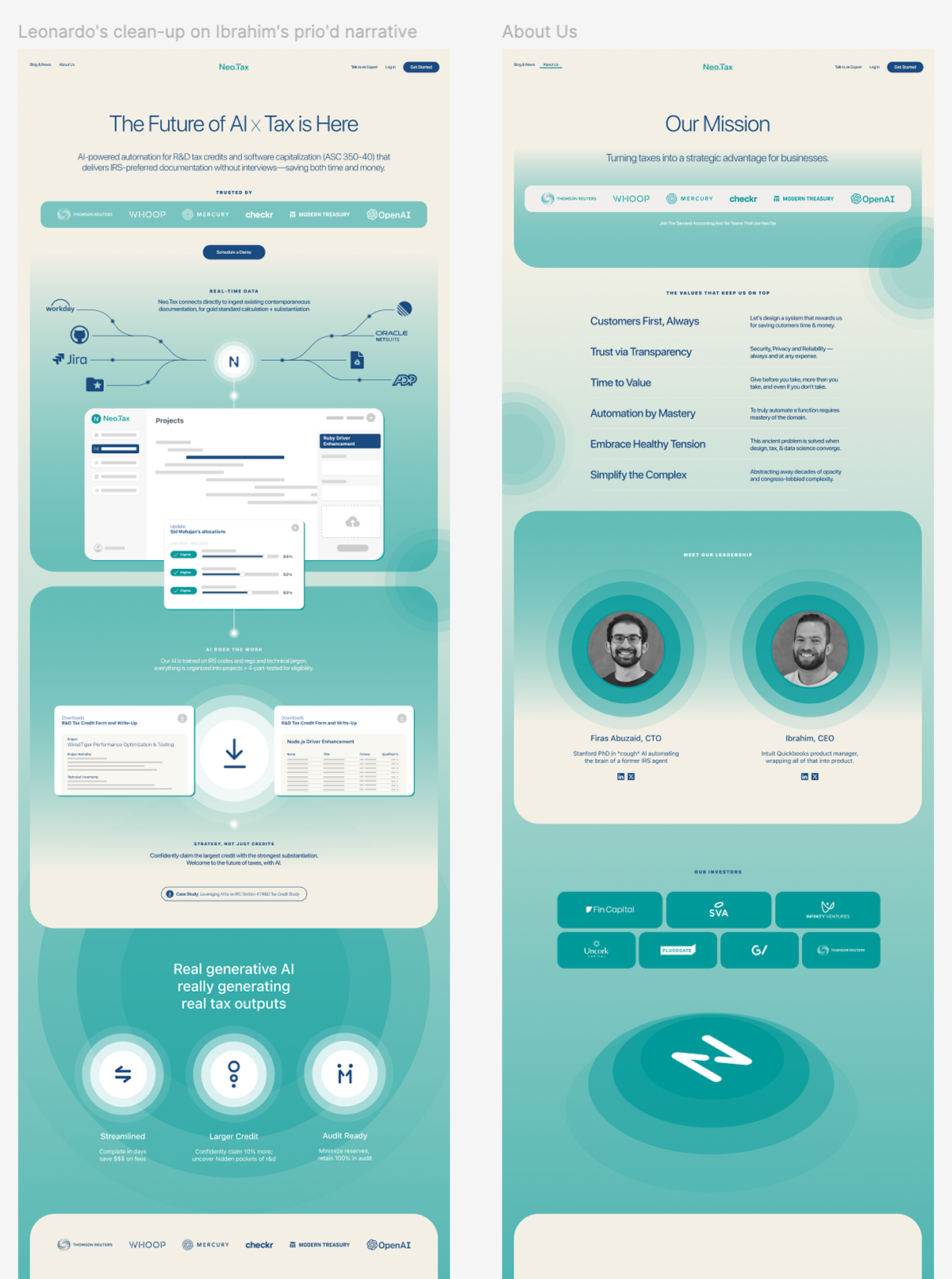
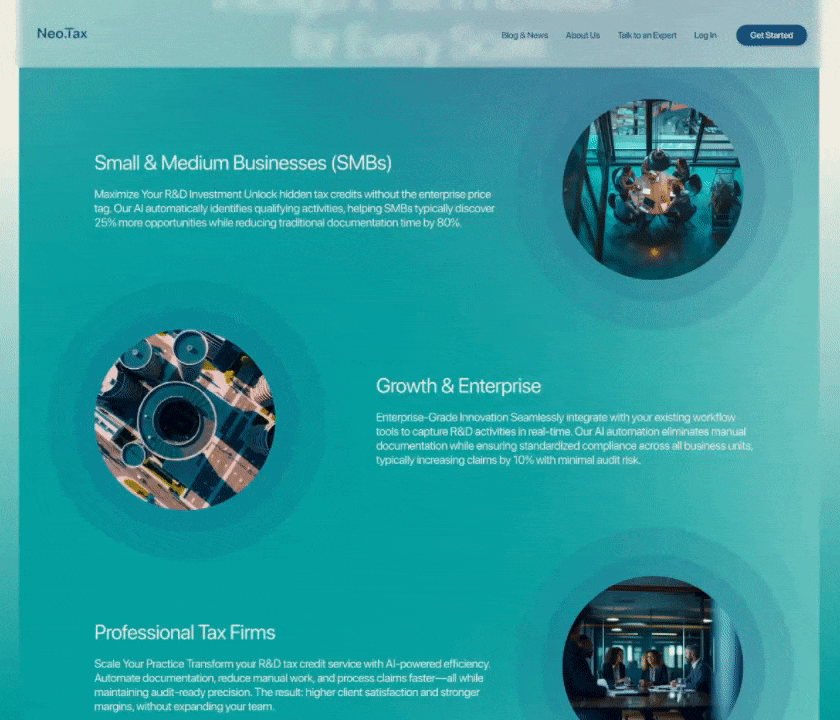
Extending The System: About And Beyond
On the About page, I wanted visitors to feel they never left the same product story.
Reframed the mission into a clear single-line statement, supported by a values grid that shows how the team operates.
Used circular, radiating shapes around founder portraits to echo the signal and network metaphor from the hero.
Built an investor and partner band using the same card, spacing, and logo patterns as the homepage.
From there, we started layering in lightweight motion and AI-generated visuals:
Designed short clips that show data flowing into Neo.Tax and turning into structured, audit-ready outputs.
Used AI tools as a starting point for subtle illustrations and textures, then curated and edited them heavily so they matched the system instead of fighting it.
Kept motion intentionally modest, supporting comprehension instead of competing with the numbers.
Later Rounds, More Approachability
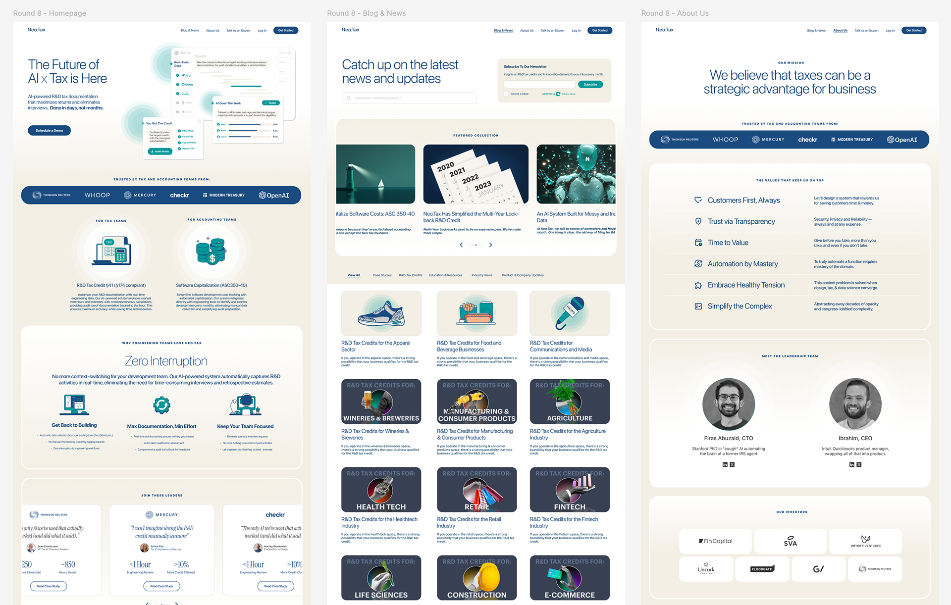
In rounds 6 through 8, the focus moved from credibility to approachability.
Lightened the overall palette with more soft teal and off white, keeping navy as a supporting color.
Increased illustration energy with precise nodes and pathways that visualize how credits are found and validated.
Tuned shadows, corner radii, and card layering to feel more tactile and less flat.
Simplified copy and labels so structure and visuals could do more of the communication.
These passes are where the meticulous details came together: pixel-perfect spacing between logo rows, consistent glow radii around the “N” icon, and typography tuned to avoid awkward line wraps at common viewport widths.
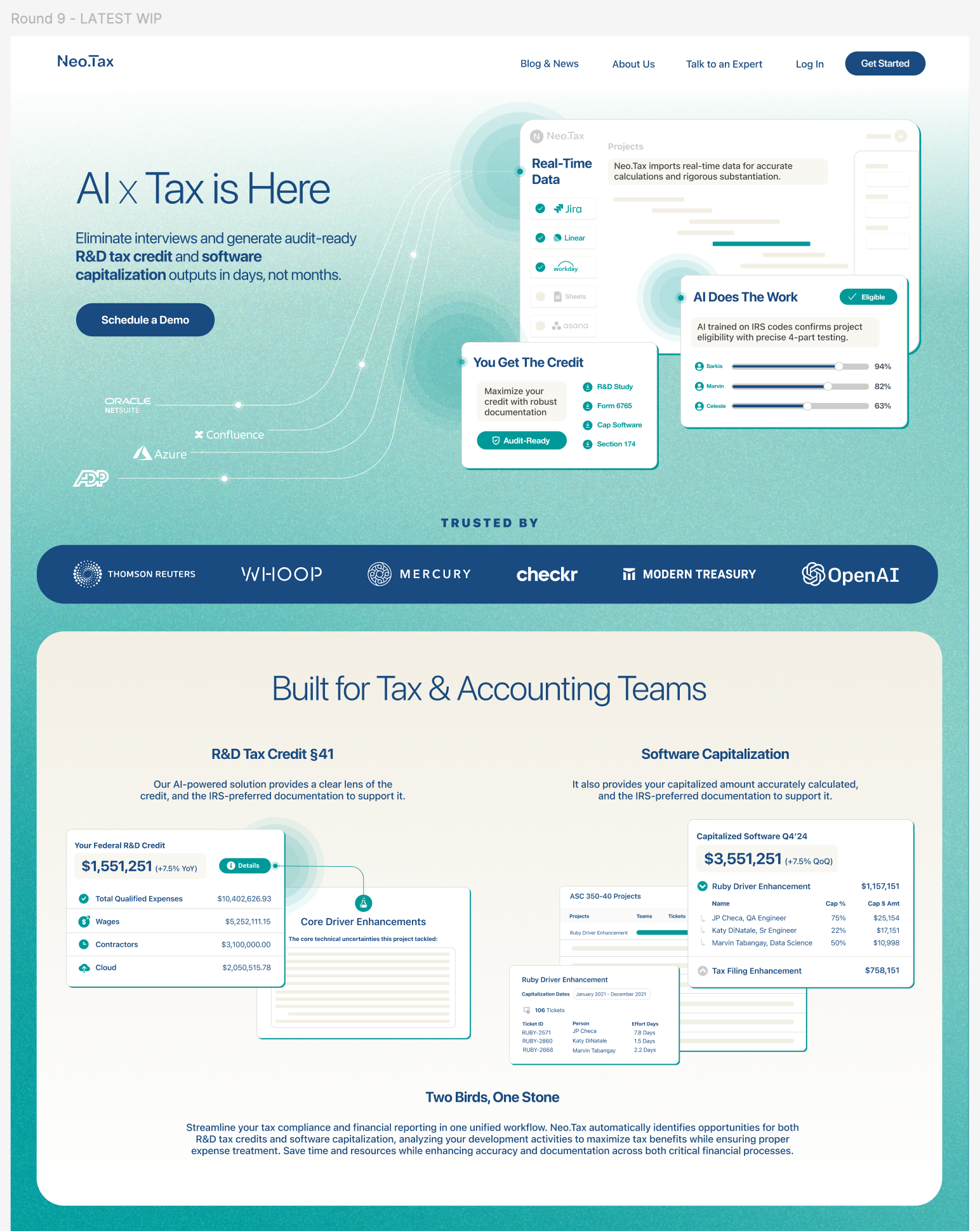
By the time we reached the final layout, every major decision had been pressure tested in real context.
Craft Notes, Where The Pixel Work Shows Up
Some details that matter here:
Information density in the hero card
Enough rows and columns to feel like a real product snapshot, without collapsing into a tiny spreadsheet.
Enough rows and columns to feel like a real product snapshot, without collapsing into a tiny spreadsheet.
Shared radius language
Cards, pills, and the central “N” badge all derive from a small set of radius values. This keeps the page calm instead of noisy.
Cards, pills, and the central “N” badge all derive from a small set of radius values. This keeps the page calm instead of noisy.
Logo handling as a trust pattern
Customer and investor strips use consistent spacing and tinting so large logos feel integrated, not slapped on top of the design.
Customer and investor strips use consistent spacing and tinting so large logos feel integrated, not slapped on top of the design.
Vertical rhythm and gradient stops
Section padding and background transitions are tuned so the scroll feels continuous. No harsh breaks where colors or shadows collide.
Section padding and background transitions are tuned so the scroll feels continuous. No harsh breaks where colors or shadows collide.
Dev-ready components
In Figma, everything is built as components and style tokens with clear naming and constraints. The handoff to engineers is straightforward and preserves the craft from the design file.
In Figma, everything is built as components and style tokens with clear naming and constraints. The handoff to engineers is straightforward and preserves the craft from the design file.
This project is a good example of how I lead at multiple levels. I am comfortable partnering with founders on narrative and positioning, and I still care deeply about three-pixel nudges that change how trustworthy a product feels.
Impact
The redesigned homepage is in phased rollout. Early signals:
Prospective customers understand what Neo.Tax does much faster.
Sales and founder conversations now start from the hero and product visuals instead of a long explanation.
The brand makes a stronger first impression on partners, investors, and enterprise buyers while staying distinct from generic fintech.
The same system now extends into blog and knowledge content so R&D credit and ASC 350-40 articles feel connected to one coherent product story.
What This Project Says About My Design Leadership
This work sits at the intersection of design leadership, AI literacy, and craft.
I helped a founder sharpen the story and positioning of a complex AI product in a conservative domain.
I translated that story into a homepage that balances conversion goals with the scrutiny of finance and engineering leaders.
I personally owned the visual system, motion approach, and pixel-level decisions that make the experience feel trustworthy and premium.
I lead large design teams in my day job, and projects like Neo.Tax are how I keep my hands in the work, practicing the craft that my leadership is built on.