A closer look at my process for a coffee identity project.
![](https://cdn.myportfolio.com/c803f6ce2ab60b622b6a9ae0c61fa5ea/7a21e76c-cc99-42fd-888c-7d46efb7f6ec_rw_1920.png?h=cd19297367f50d4ef187f9021cf88f4a)
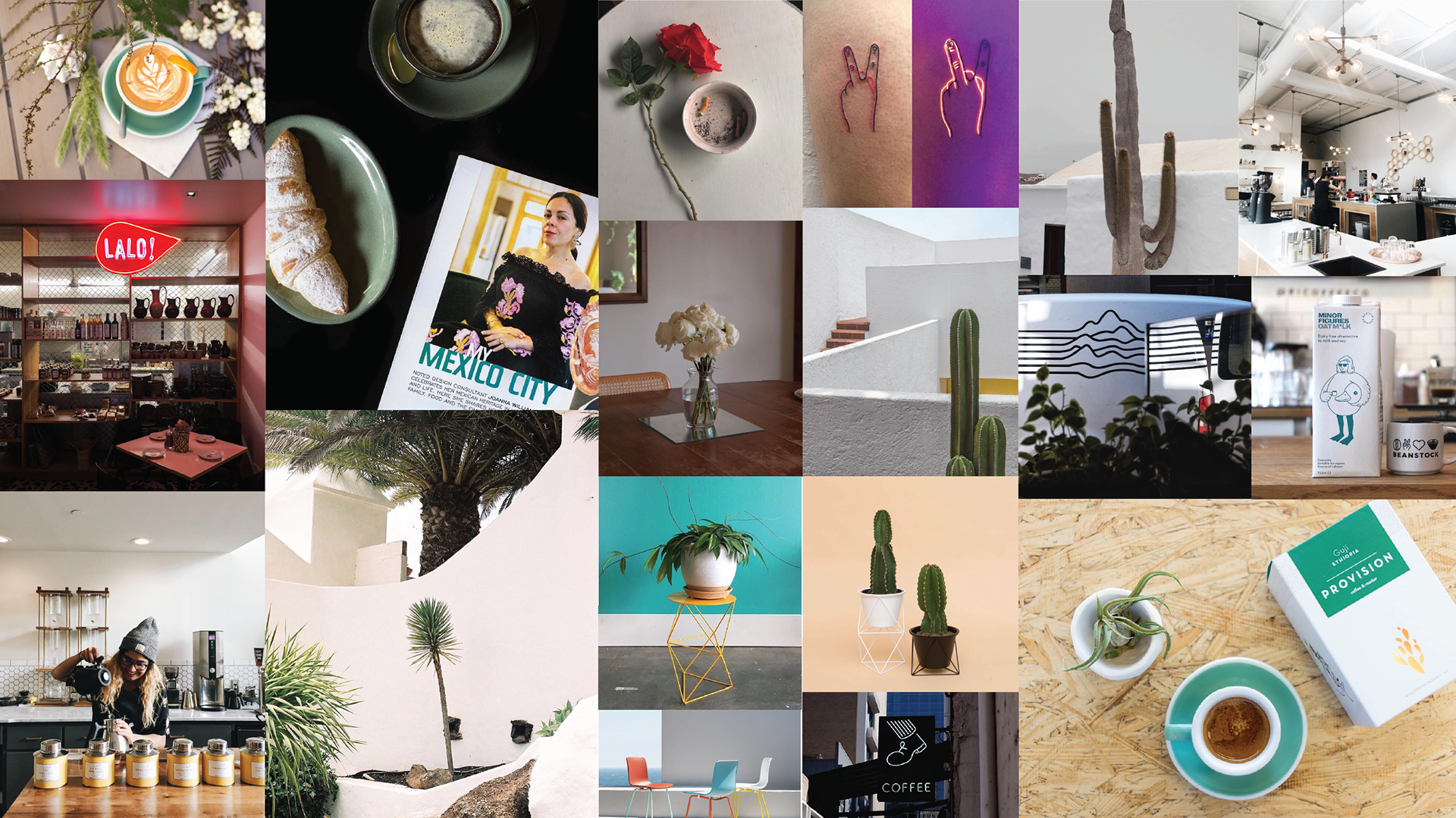
It began with an instagram mood board. Essentially the client tagging me in dozens of images that felt on brand for them. Aspirational vibes.
![](https://cdn.myportfolio.com/c803f6ce2ab60b622b6a9ae0c61fa5ea/4e93bd88-9b40-4e1c-9727-6e5b7cc4ced7_rw_1920.png?h=7e76aa5b5b2a0ecda11b42606e1a4d38)
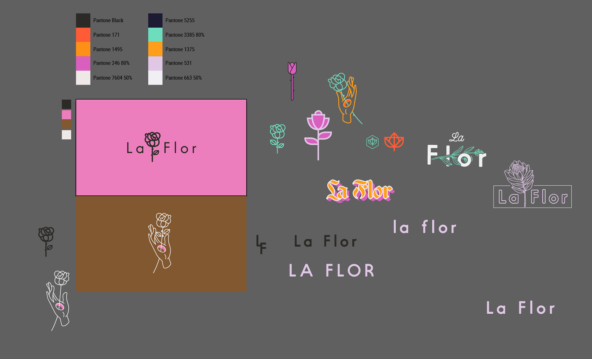
Drawing over the more pronounced shapes with a restricted palette gave me an abstract look at the colors driving the feel of their soon-to-be brand.
![](https://cdn.myportfolio.com/c803f6ce2ab60b622b6a9ae0c61fa5ea/b1ef1e16-e4cf-4fc6-be99-87b06eaf12f3_rw_1920.png?h=3e0be5892535544839e8f2e6b2f60406)
Limited the palette further.
![](https://cdn.myportfolio.com/c803f6ce2ab60b622b6a9ae0c61fa5ea/2a22e3d1-9a1e-4247-823e-df0eff6e45c3_rw_1920.png?h=911236a6bedfe8b797052dd127d08427)
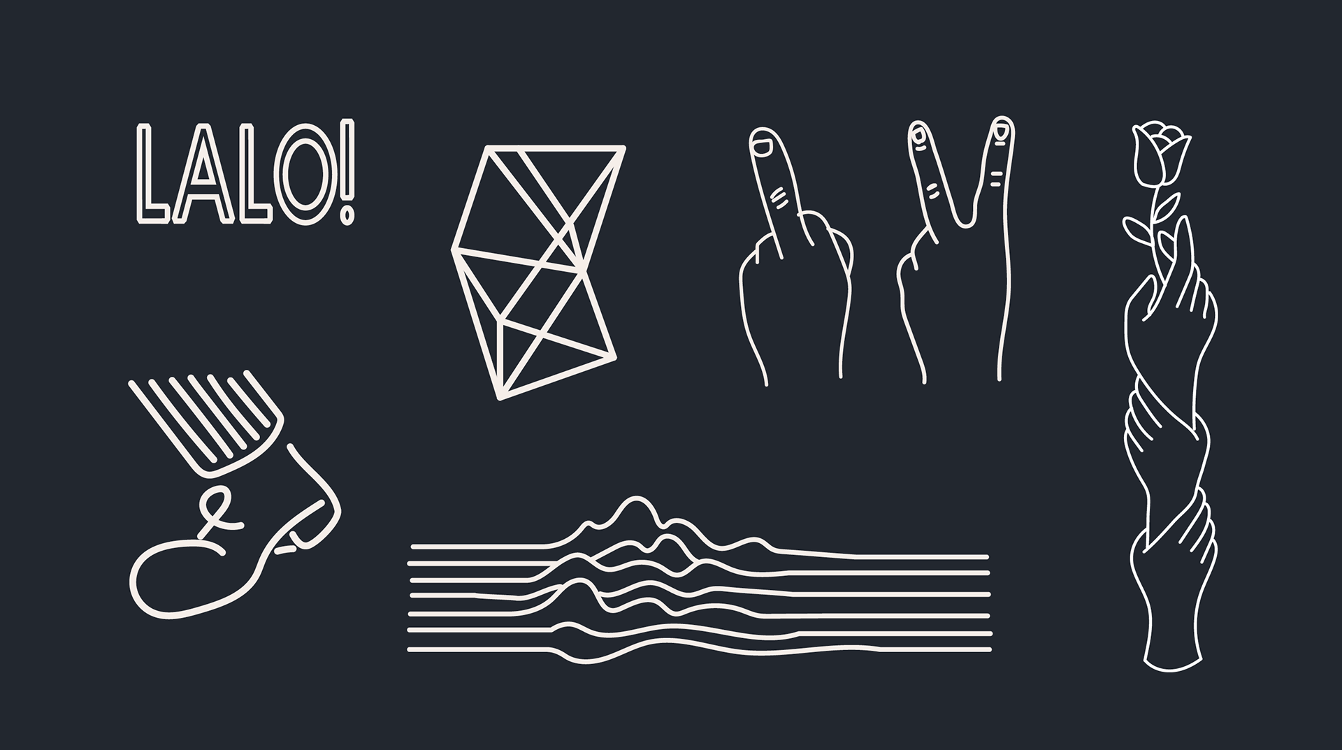
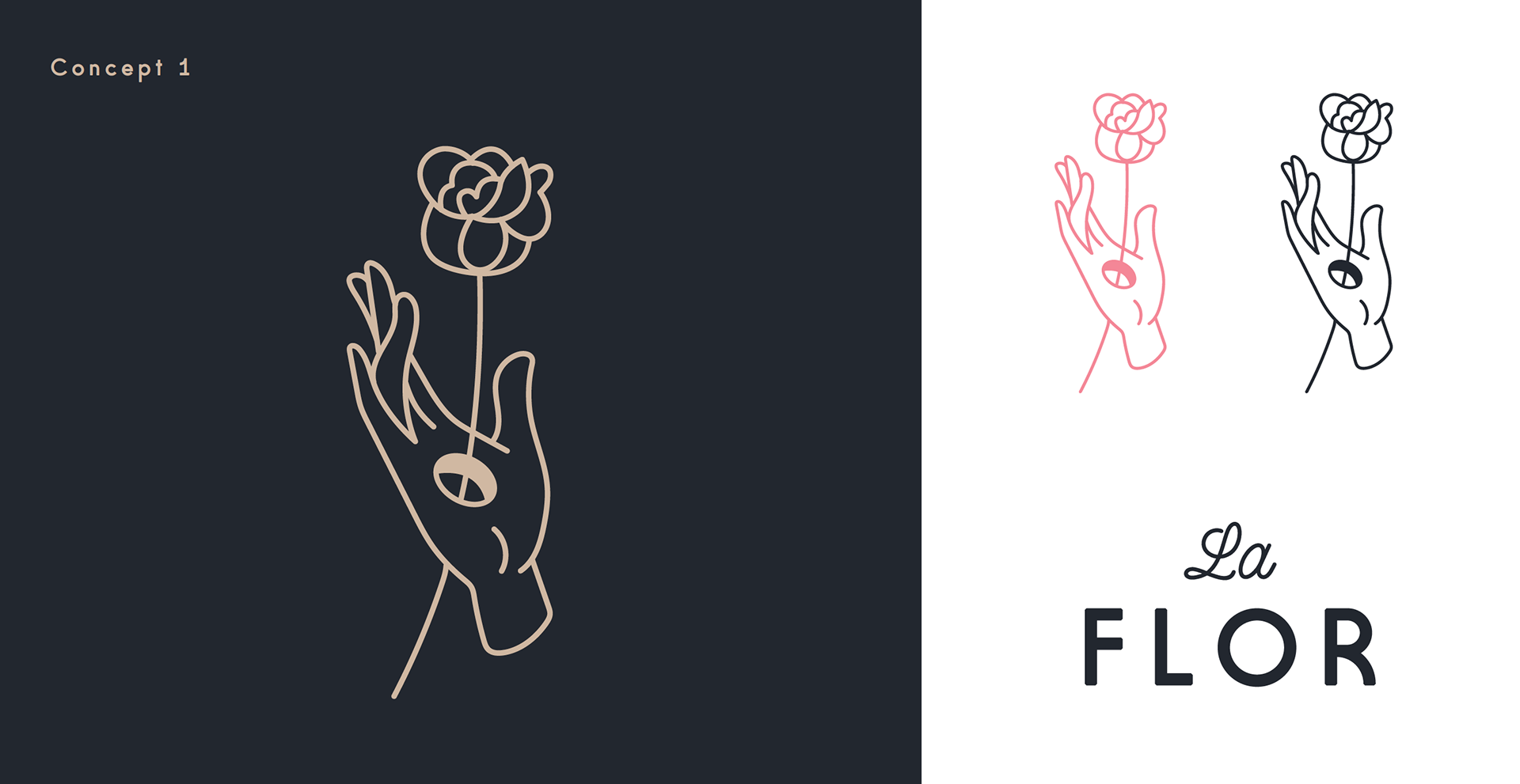
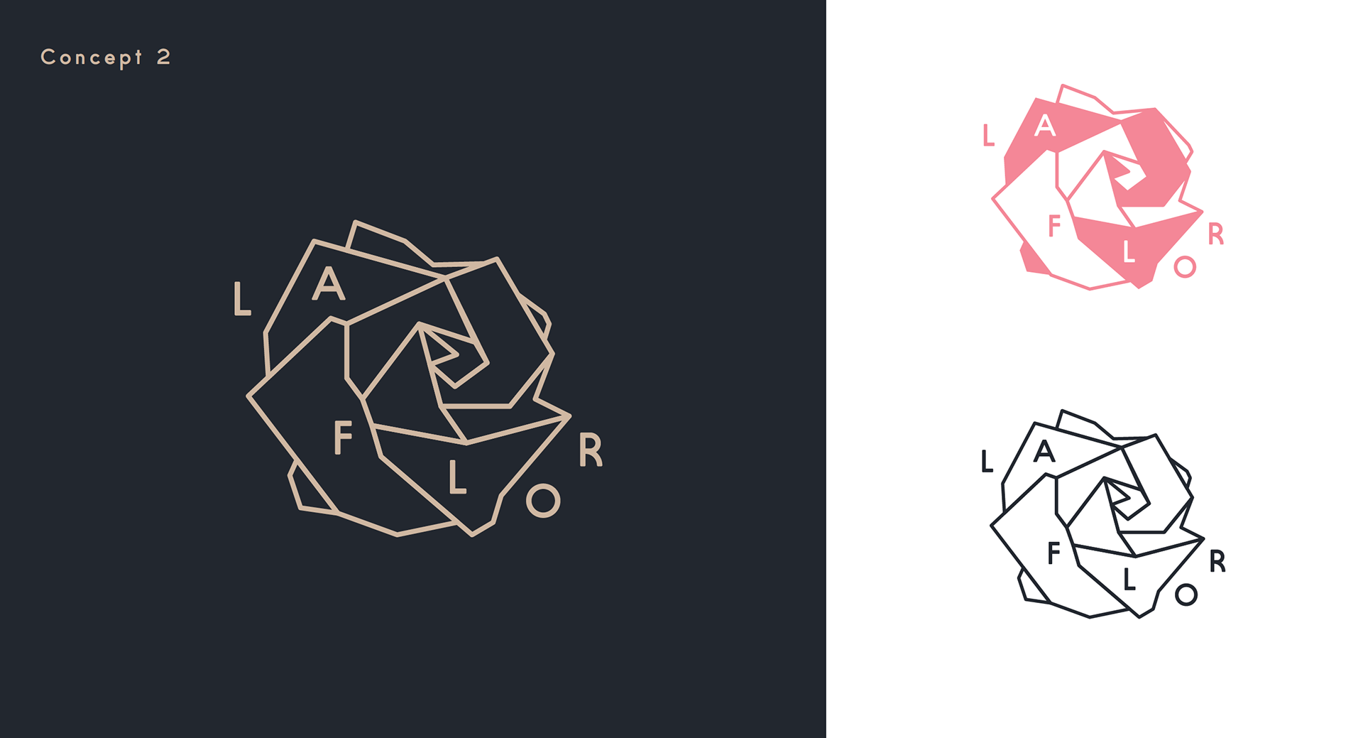
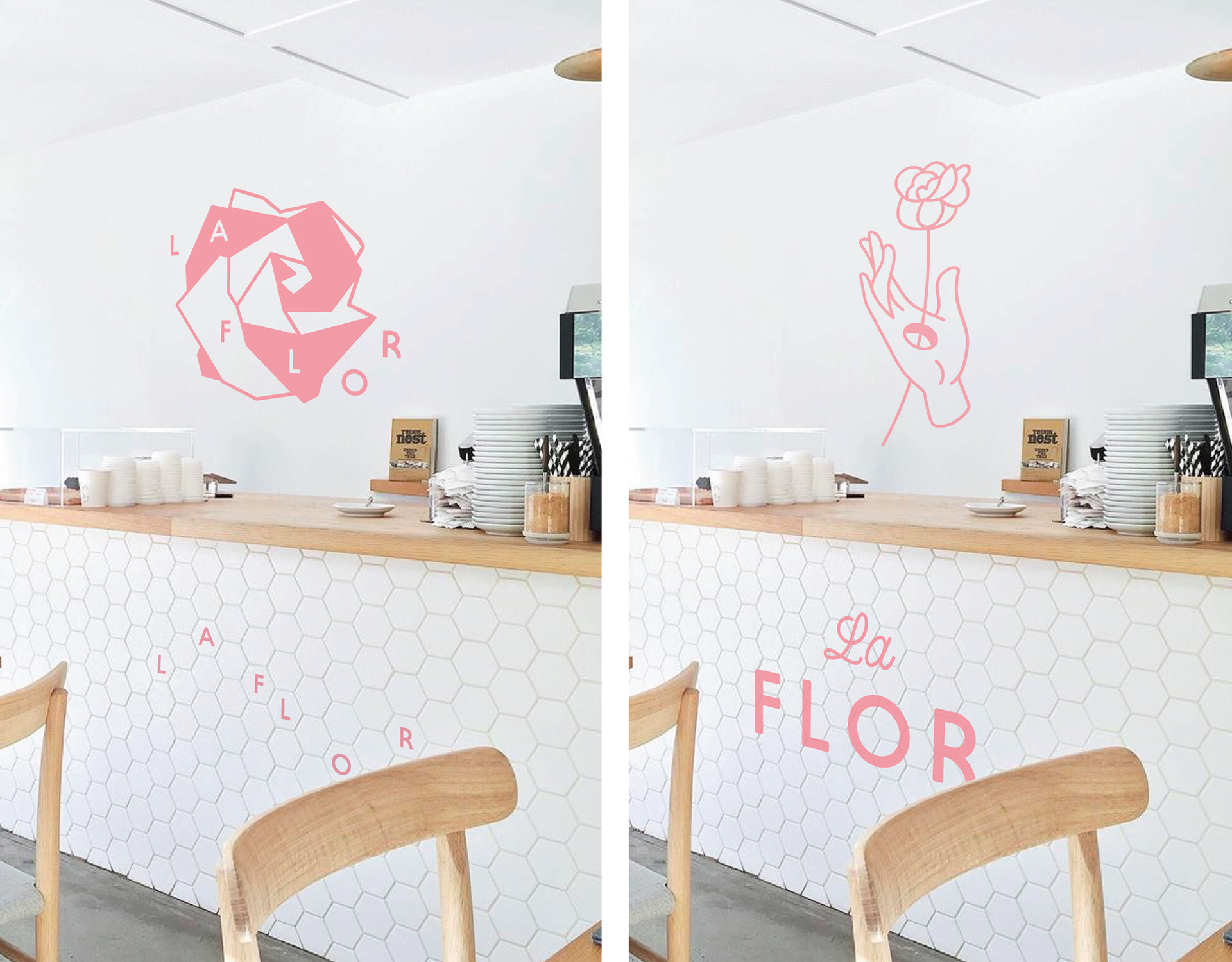
Next, I line traced over some of the iconography and type that resonated with the client. This helped clarify the casual outline style and softer type that would guide the identity.
![](https://cdn.myportfolio.com/c803f6ce2ab60b622b6a9ae0c61fa5ea/d7824472-1a39-4aab-85d0-7d7f5b41dca1_rw_1920.png?h=971adf2550e723d11b748ffcb960261f)
![](https://cdn.myportfolio.com/c803f6ce2ab60b622b6a9ae0c61fa5ea/93a41de2-ac14-4082-a3a5-ef7bc95a7412_rw_1920.png?h=baa6b8d0f4100d7077e1309c84a9e3c2)
![](https://cdn.myportfolio.com/c803f6ce2ab60b622b6a9ae0c61fa5ea/57848ebb-ae59-487c-b57a-ebb8639cb27d_rw_1920.png?h=77fe93c2f280941613d78a8e46a0e2fa)
![](https://cdn.myportfolio.com/c803f6ce2ab60b622b6a9ae0c61fa5ea/2f3c0c51-91c0-4a61-8db8-f157281c4692_rw_1920.png?h=40cef2d6ac8b6cede9872eb4648390fb)
![](https://cdn.myportfolio.com/c803f6ce2ab60b622b6a9ae0c61fa5ea/affc50a6-b913-4c29-a41d-9e5119fec57a_rw_1920.png?h=4bb3a3fccf3a1dc7e150548d064945ff)