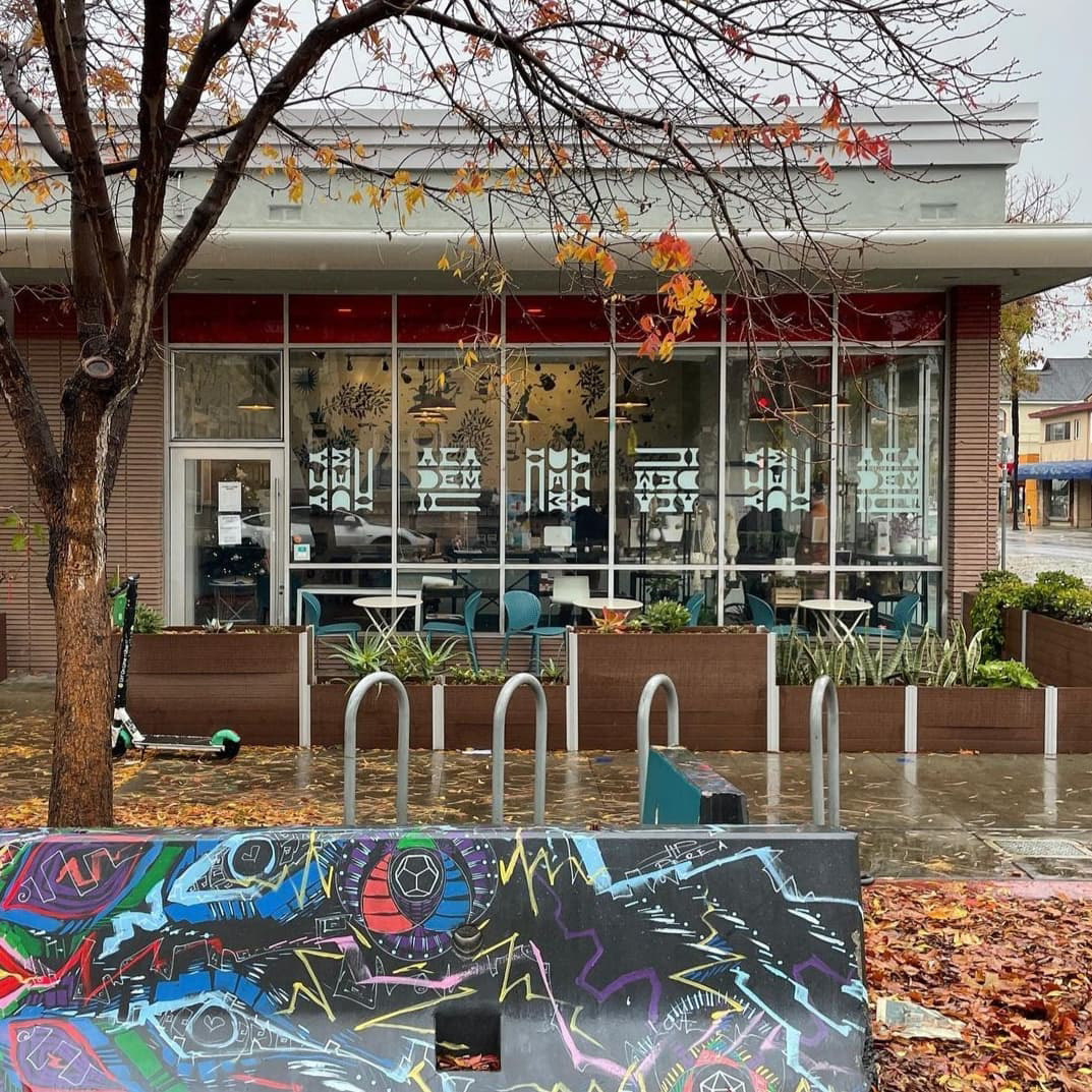
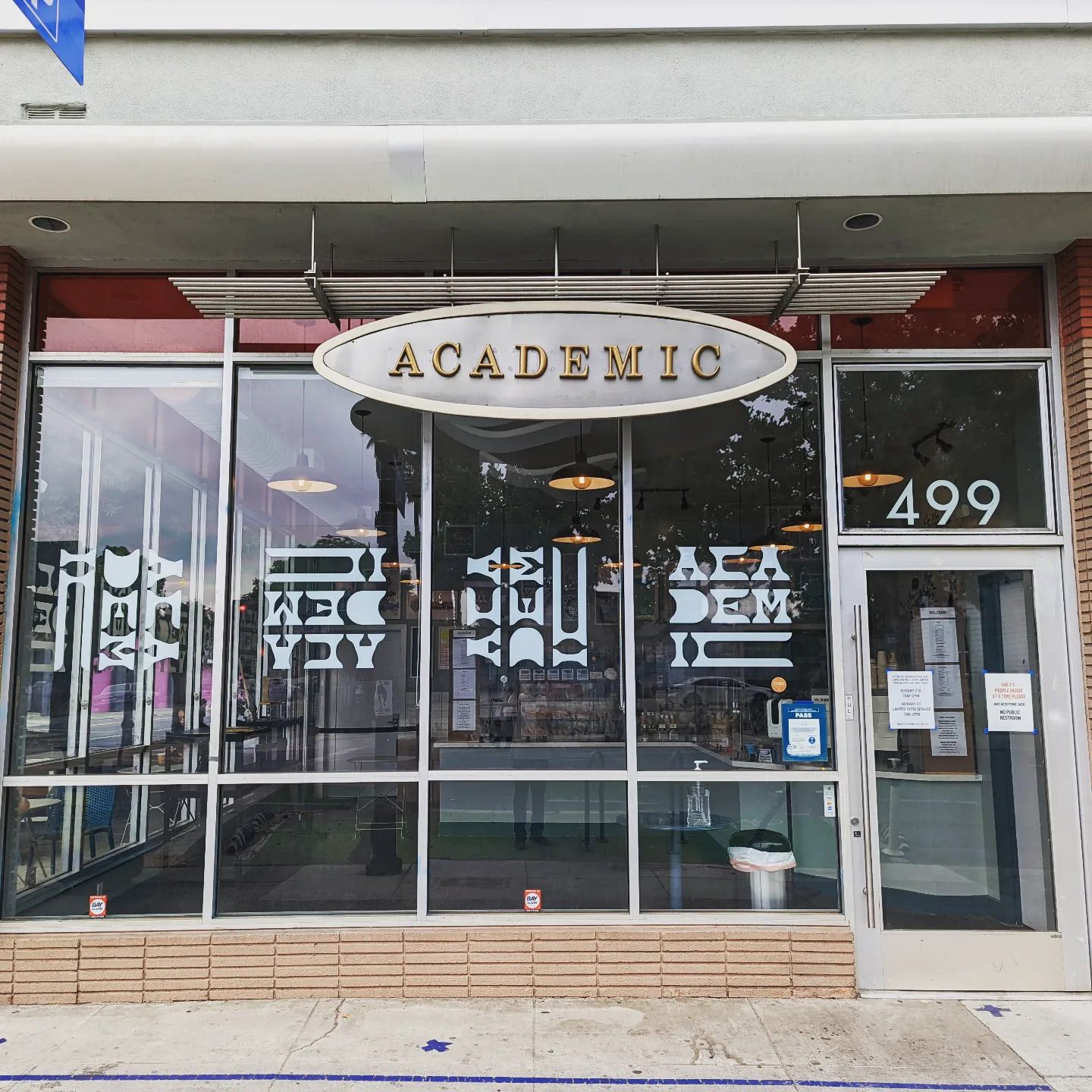
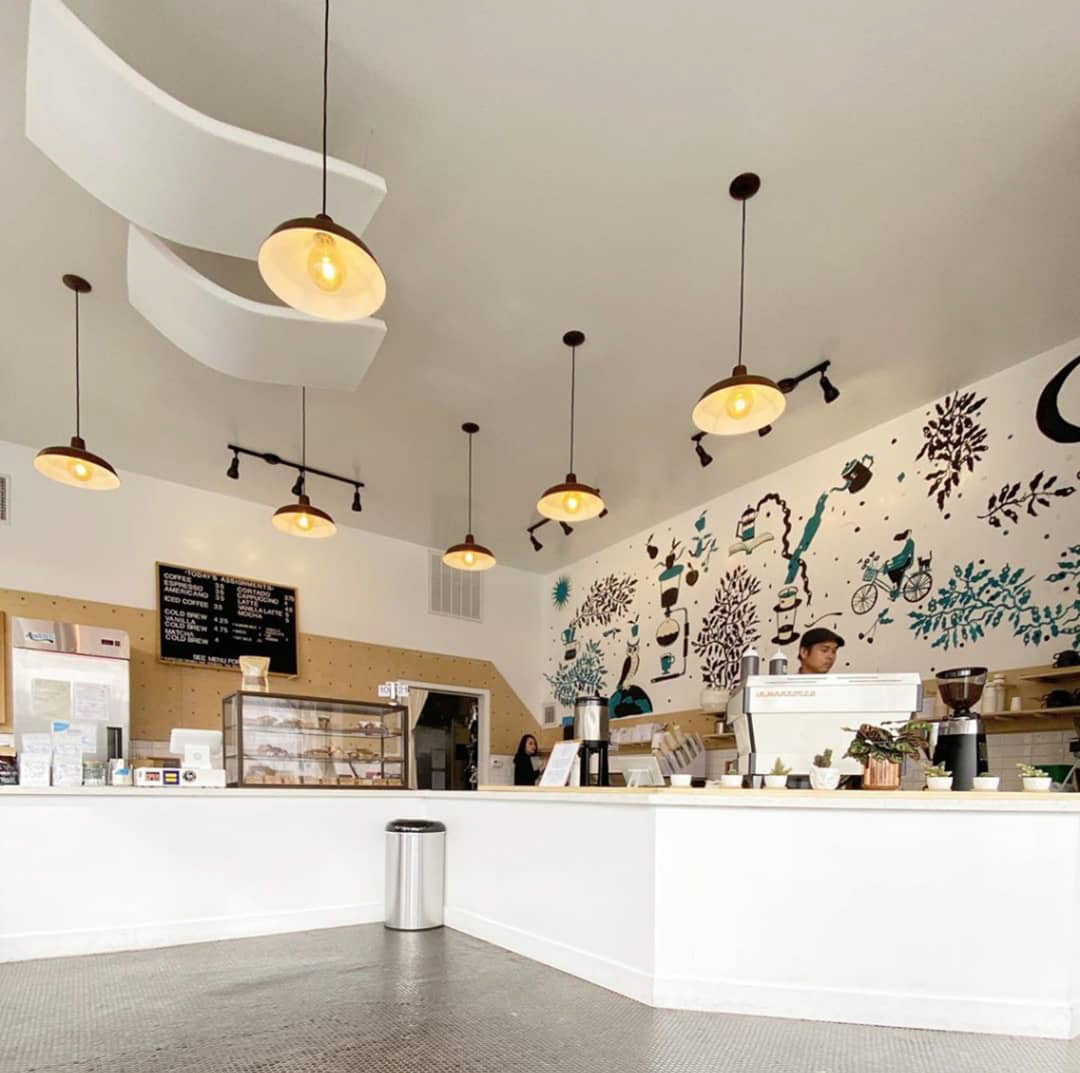
My hometown of San Jose, CA is a world-class "coffee town". It boasts myriad third wave cafes fueling a bustling start-up and tech environment as well as multiple large universities here in Silicon Valley. As an avid coffee drinker, I've narrowed my personal favorite spot to Academic Coffee, nestled in the San Jose State University neighborhood in Downtown SJ.
When the owners of Academic asked me for recommendations for agencies that could help update their branding, I couldn't help but throw my hat in the ring and offer up my weekends and evenings to modernize their visual language. My love for this cafe, its staff, and the quality of their craft fueled the end-to-end design brand identity work you see below.
Received Wisdom
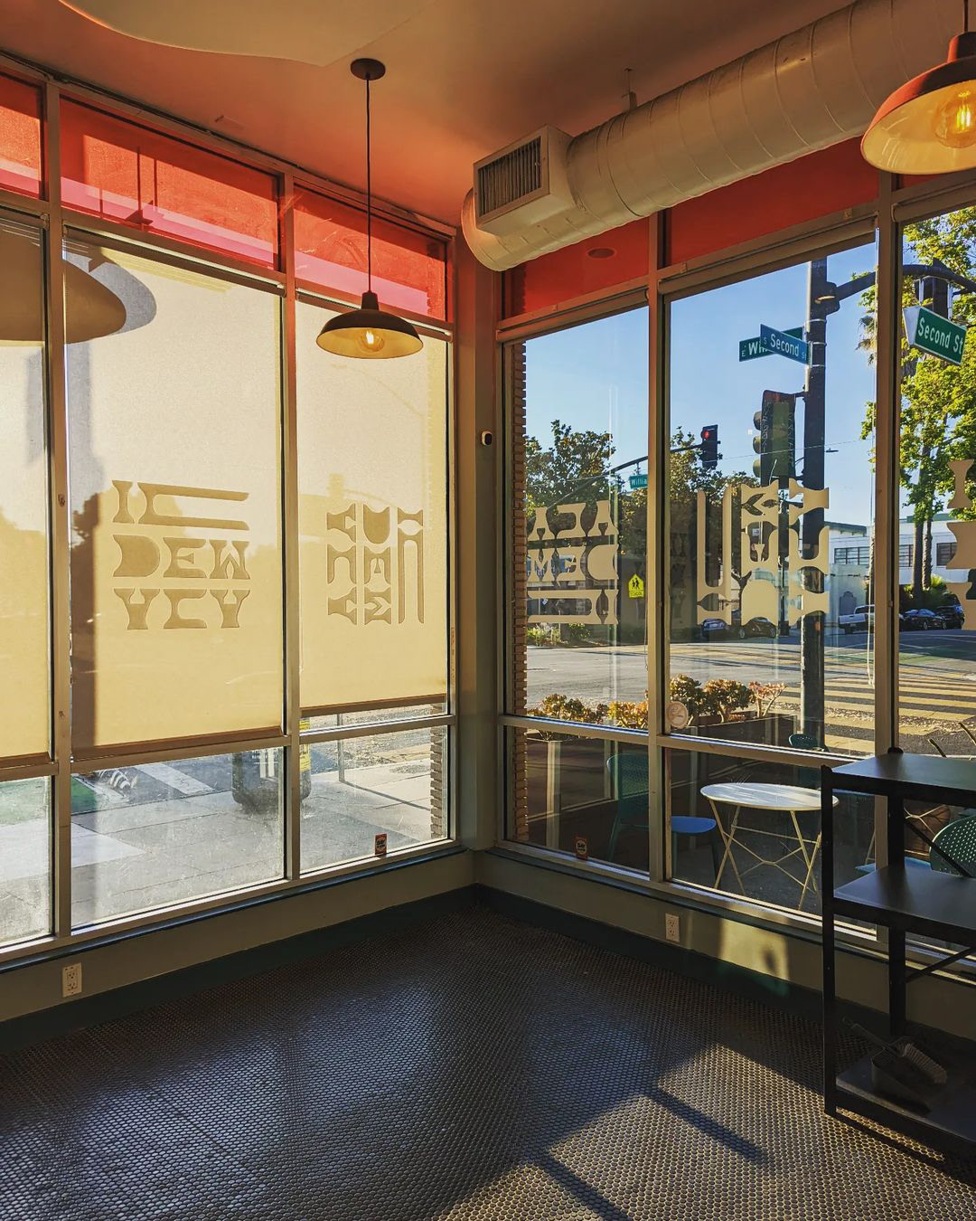
It was important to keep the soul of Academic's existing brand alive with my refresh. One of the characteristics that resonated with me was the playful typography and kettle illustration.
Something I felt we could push on, however, was the palette -- creating a brighter, friendlier, and approachable spectrum of colors that matches the personalities that staff the cafe.
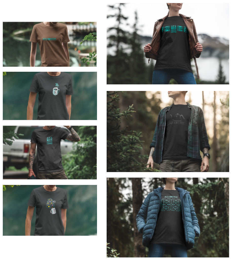
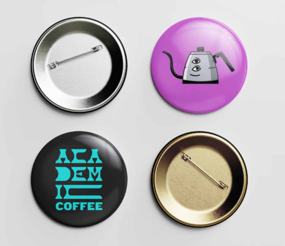
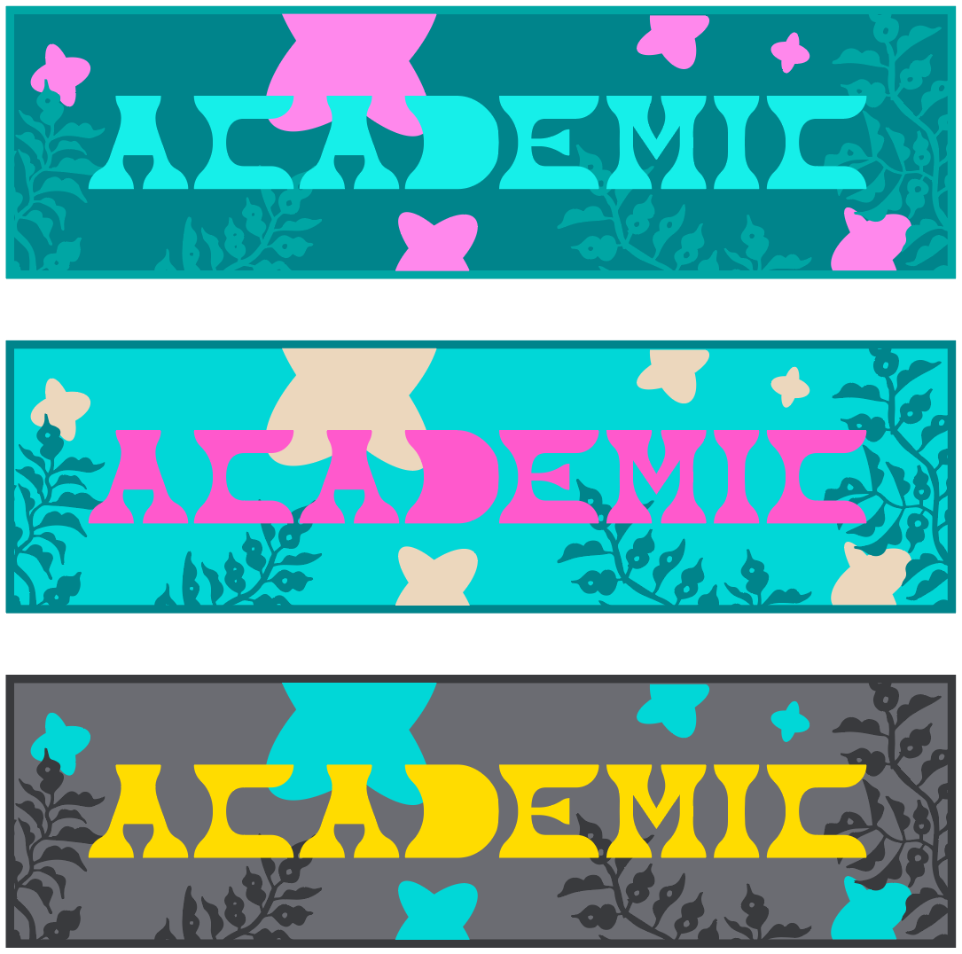
Wordmark and logo lockups
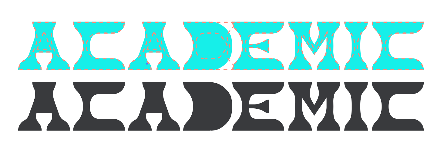
With a funky and futuristic vibe, I leaned on the KC Purple Cat font from the type foundry KERN to create the new wordmark.
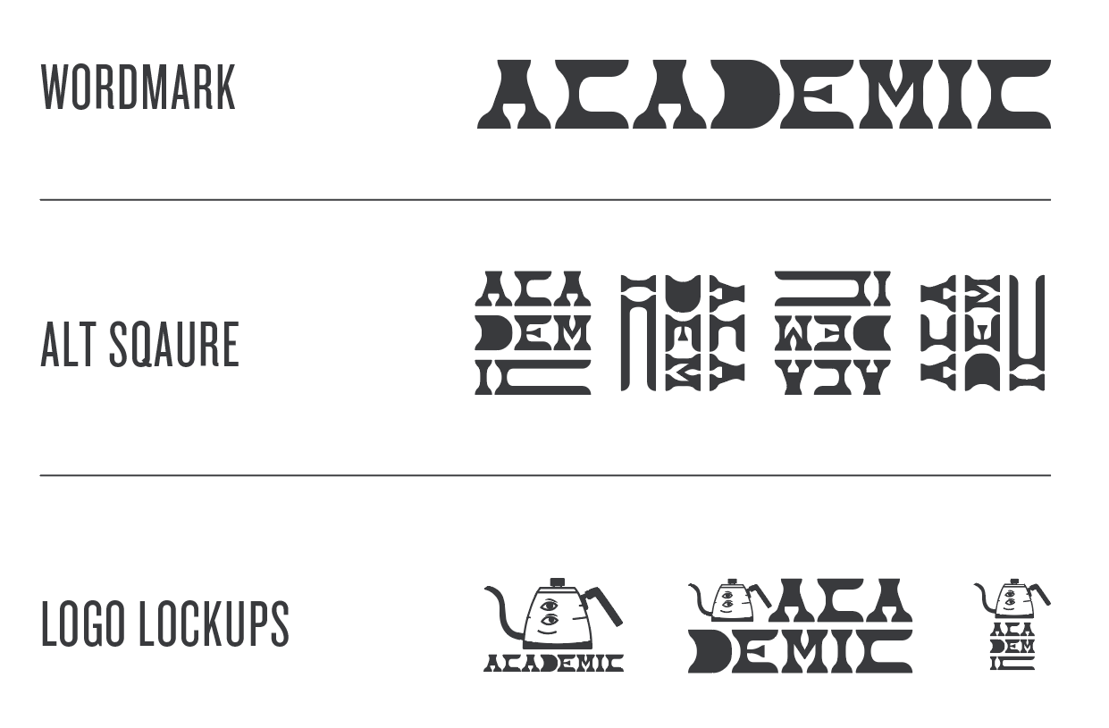
Out of the box, the Purple Cat font provides a modern, and bold feel. To improve the readability on packaging, I widened the stems and hairlines on each of the characters making up the name. As a nod to the original mark, I also kept the knocked out eyes in the As and the D.
For further improved readability of the wordmark, and legibility of the letter D specifically, I re-shaped its form and rounded it out to draw the eye from left to right.
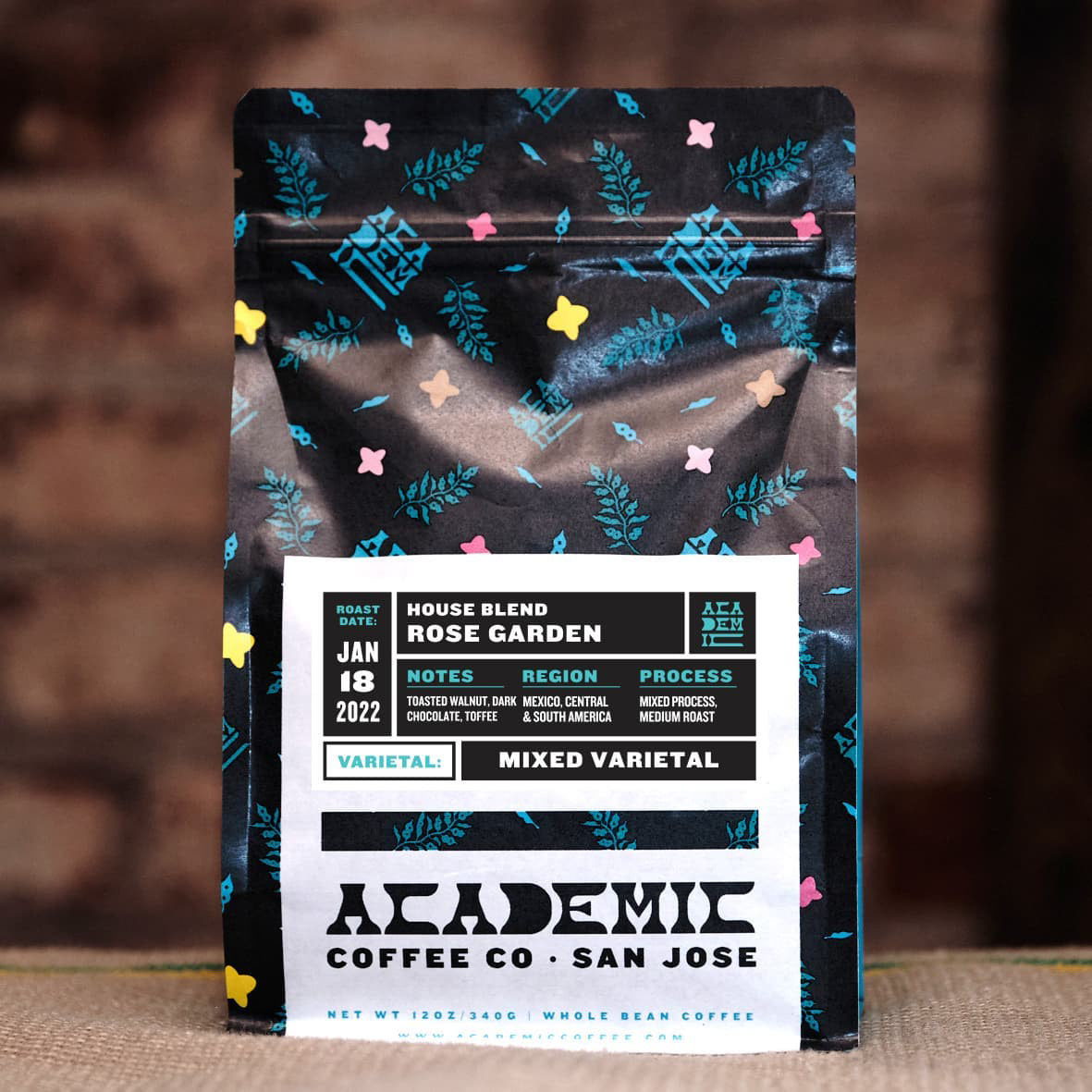
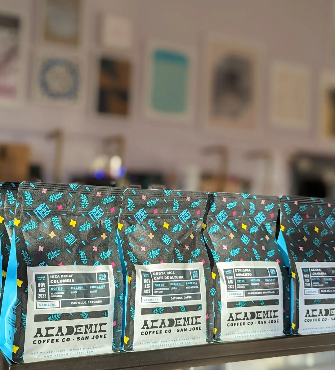
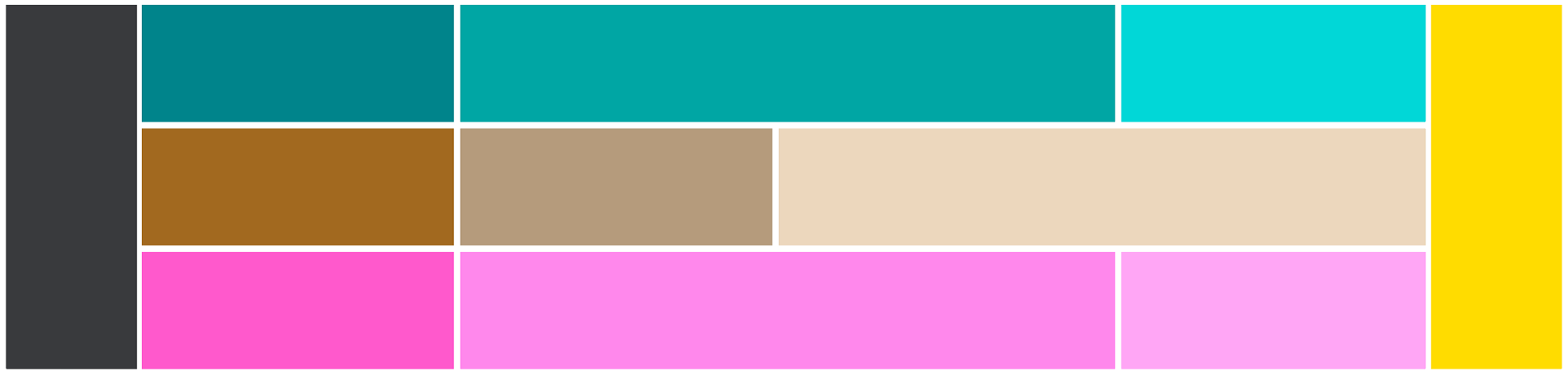
Palette
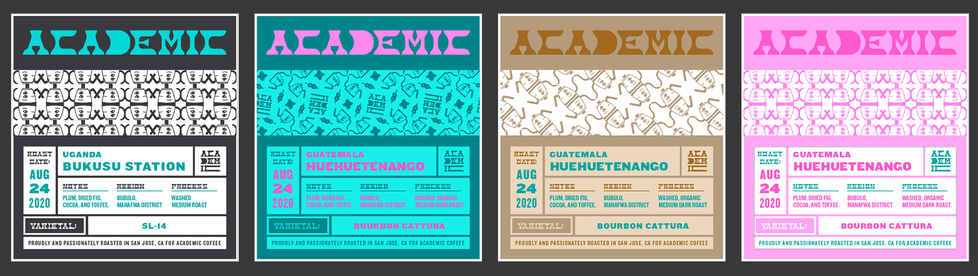
Building from the teal green I've seen countless times in the mural painted in their cafe, I built out a triadic spectrum, anchored by a cool, dark gray and a vibrating yellow. Vibrant, fun, friendly & approachable.
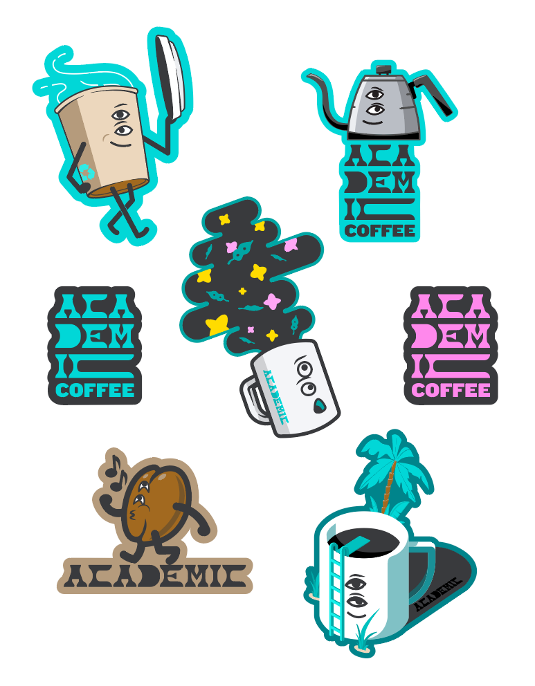
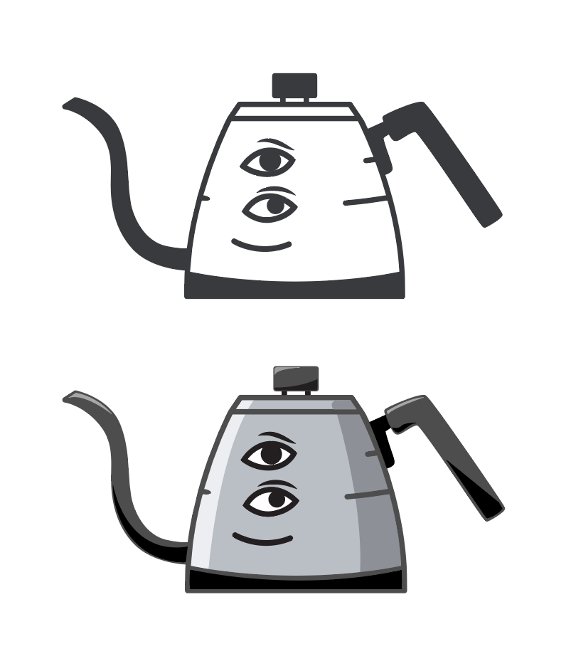
Reintroducing "Brü"
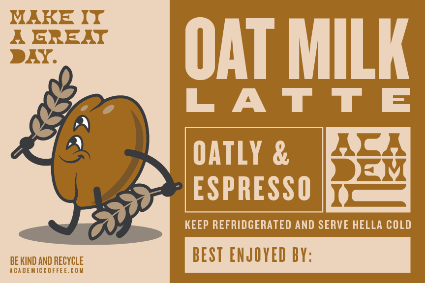
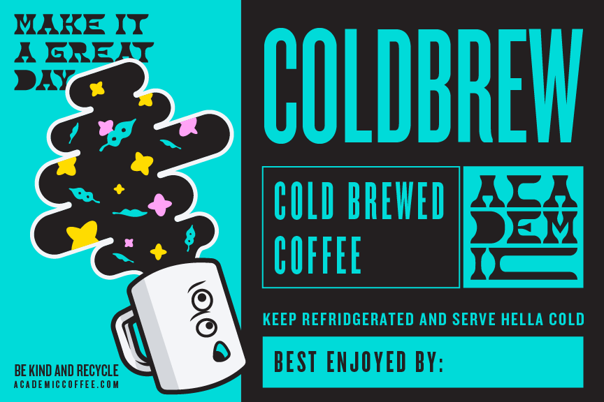
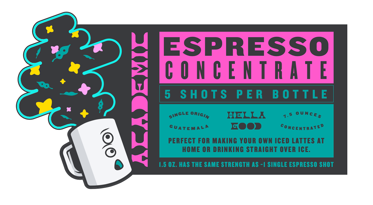
Academic's iconic kettle with stacked eyes is such a great visual. I wanted to keep this mascot close to the original illustration style, but re-shaped it to a nondescript kettle brand, and broadened the lines so that it scaled down a little more elegantly.
I also tapped a friend to help give the mascot a name... at first sight he uttered the word, "Bruh"... then made the clever association to "Brew" and there we have it. Read without the long "U" provided by the umlaut, I trust he'll answer to "Bruh" all the same.
I also tapped a friend to help give the mascot a name... at first sight he uttered the word, "Bruh"... then made the clever association to "Brew" and there we have it. Read without the long "U" provided by the umlaut, I trust he'll answer to "Bruh" all the same.
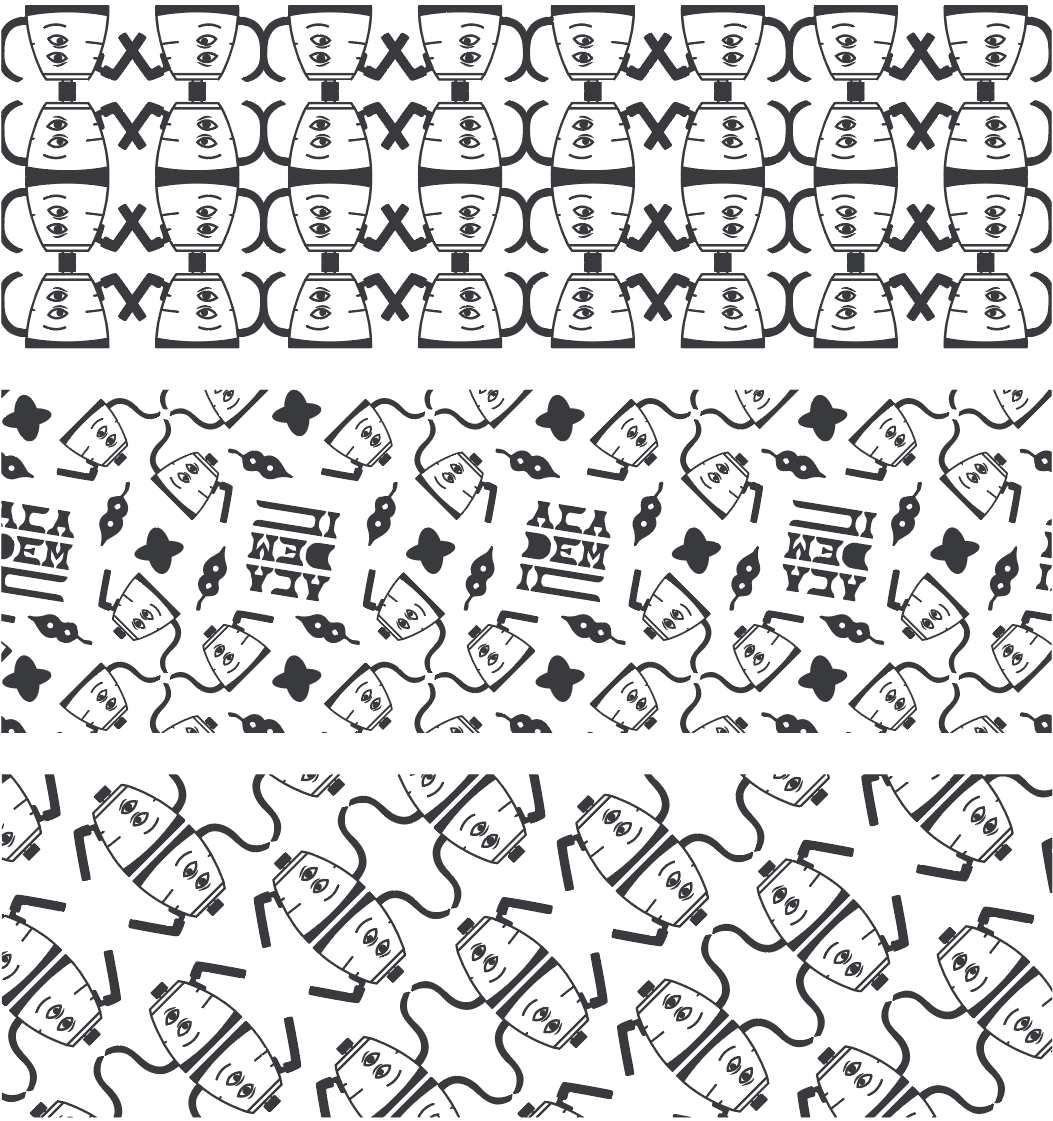
Patterns
Putting together the modernized Brü illustration, redrawn leafy shapes from the cafe's mural, and the alt-square wordmark, some lovely patterns emerged.
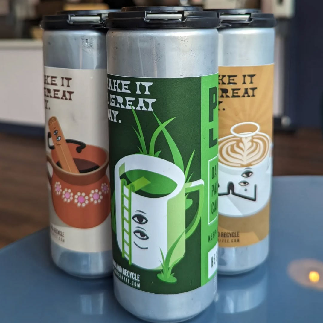
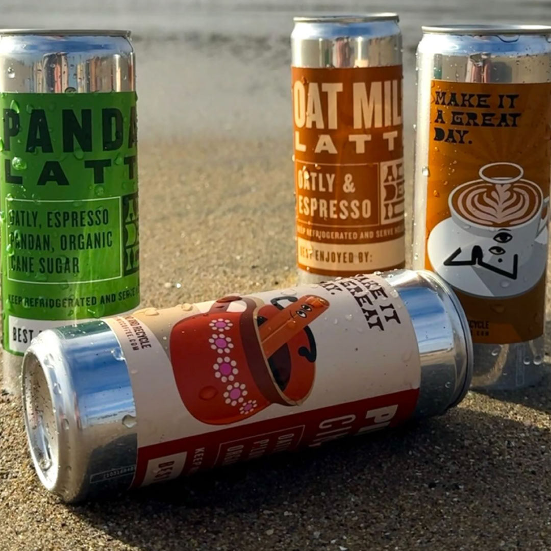
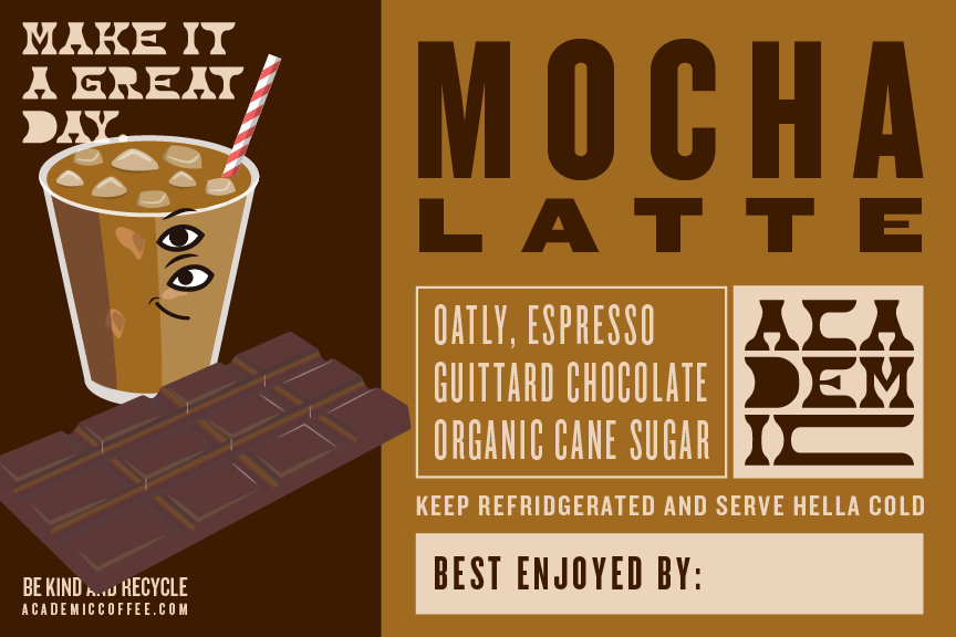
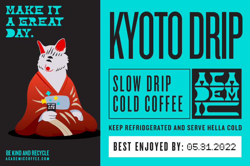
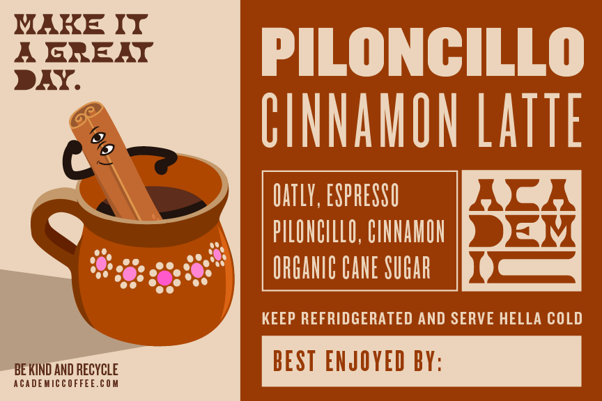
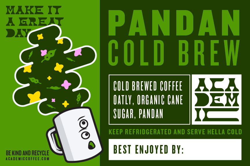
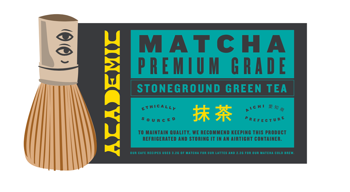
Canned beverage labels


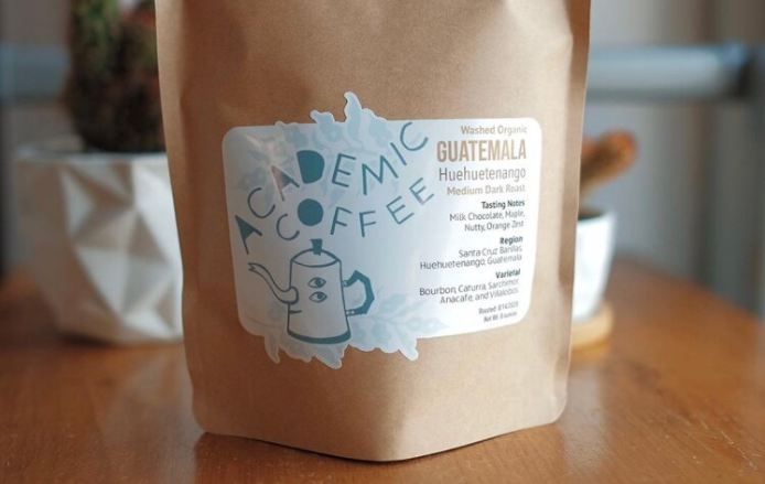
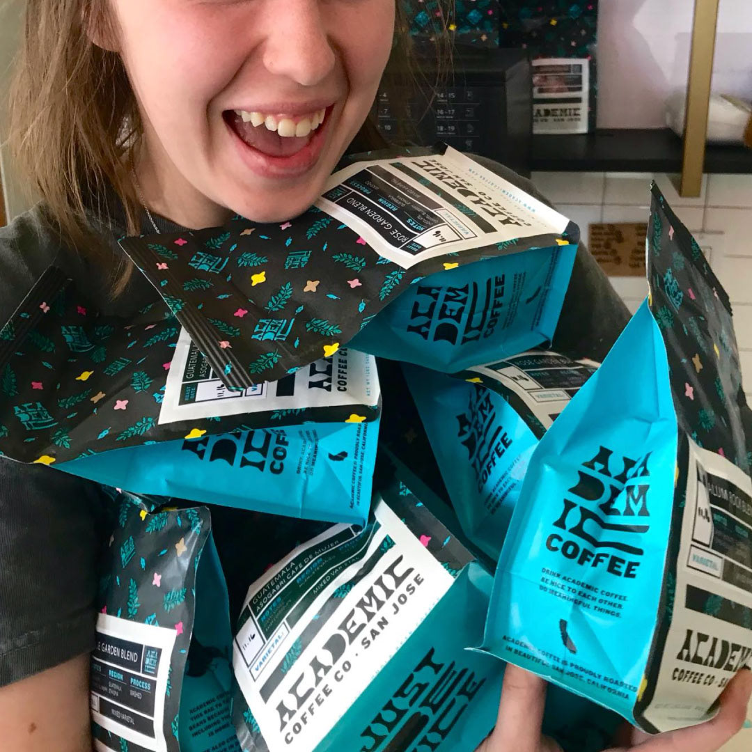
Coffee bag labels
Illustrations